The Surprising Secret to Creating the Color of the Year Pantone’s Marsala 18-1438

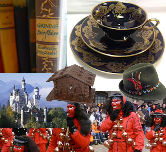
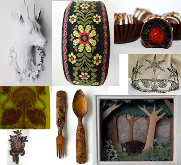
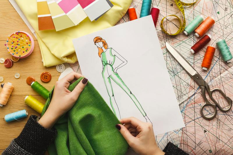
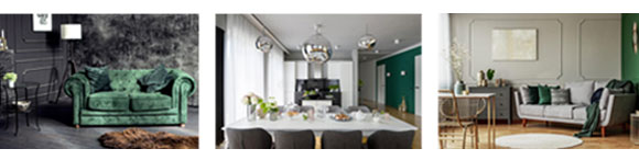
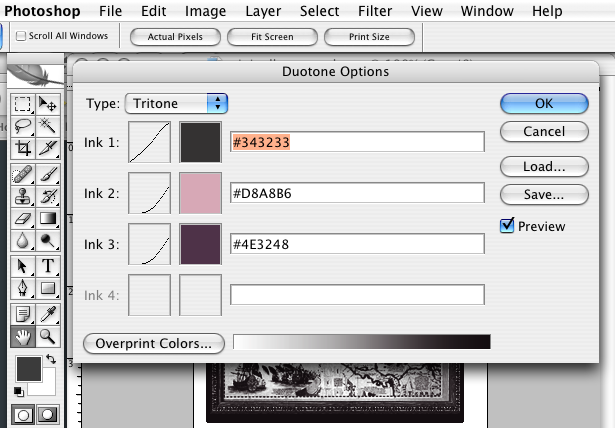
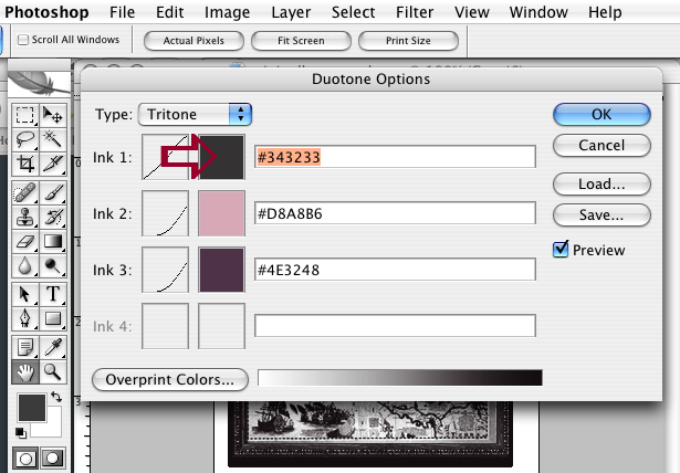
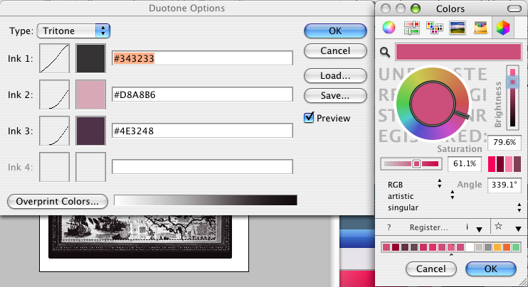
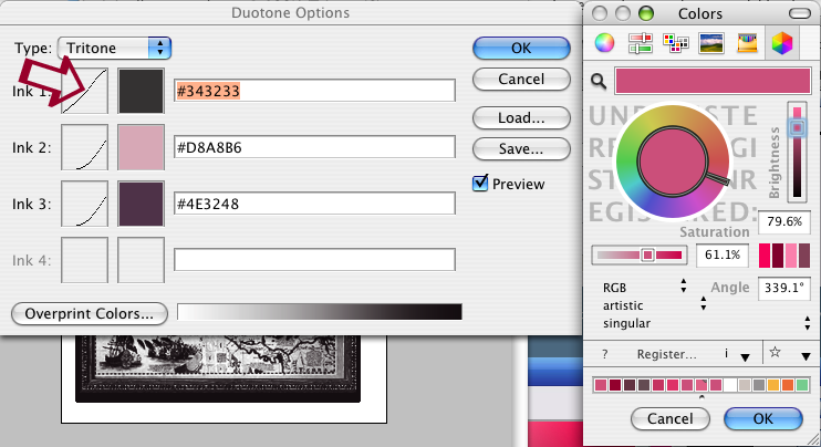
Color of the Year’s Chemistry and What’s Behind Pantone’s Marsala 18-1438

Color of the Year's Chemistry: Behind pantone's marsala 18-1438

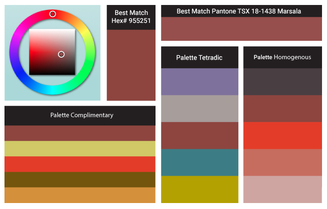
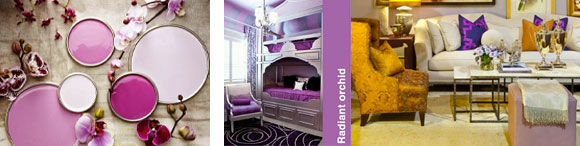
Marsala enriches our mind, body and soul, exuding confidence and stability. Much like the fortified wine that gives Marsala its name, this tasteful hue embodies the satisfying richness of a fulfilling meal, while its grounding red-brown roots emanate a sophisticated, natural earthiness. This hearty, yet stylish tone is universally appealing and translates easily to fashion, beauty, industrial design, home furnishings and interiors.

Handspun Bulky Textured Art Yarn Marsala Red Corespun and Beaded with Pearls, Carnelian, Crystal

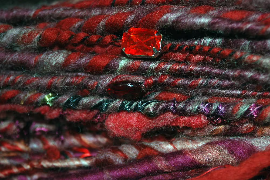
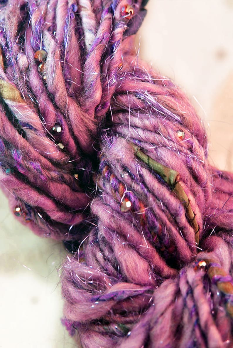
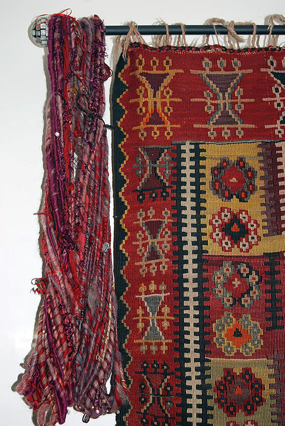
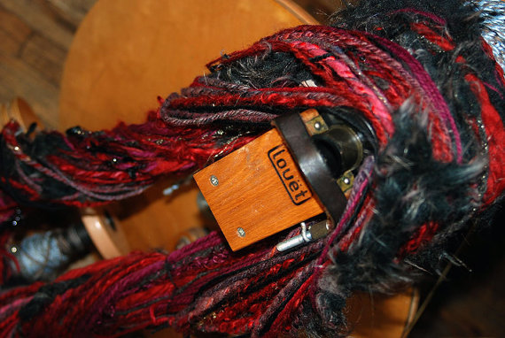
Marsala is a one of a kind art yarn that I spun. The thick and thin art yarns look amazing in finished products! Handspun corespinning is a slow spinning technique which results in the yarn looking very different from a traditional single. The fibers are allowed to wrap around a core thread at a 90 degree angle, it allows the spinner to create a very strong, soft, warm and lofty yarn. however due to the longer time it takes to create a Corespun yarn the cost is higher.

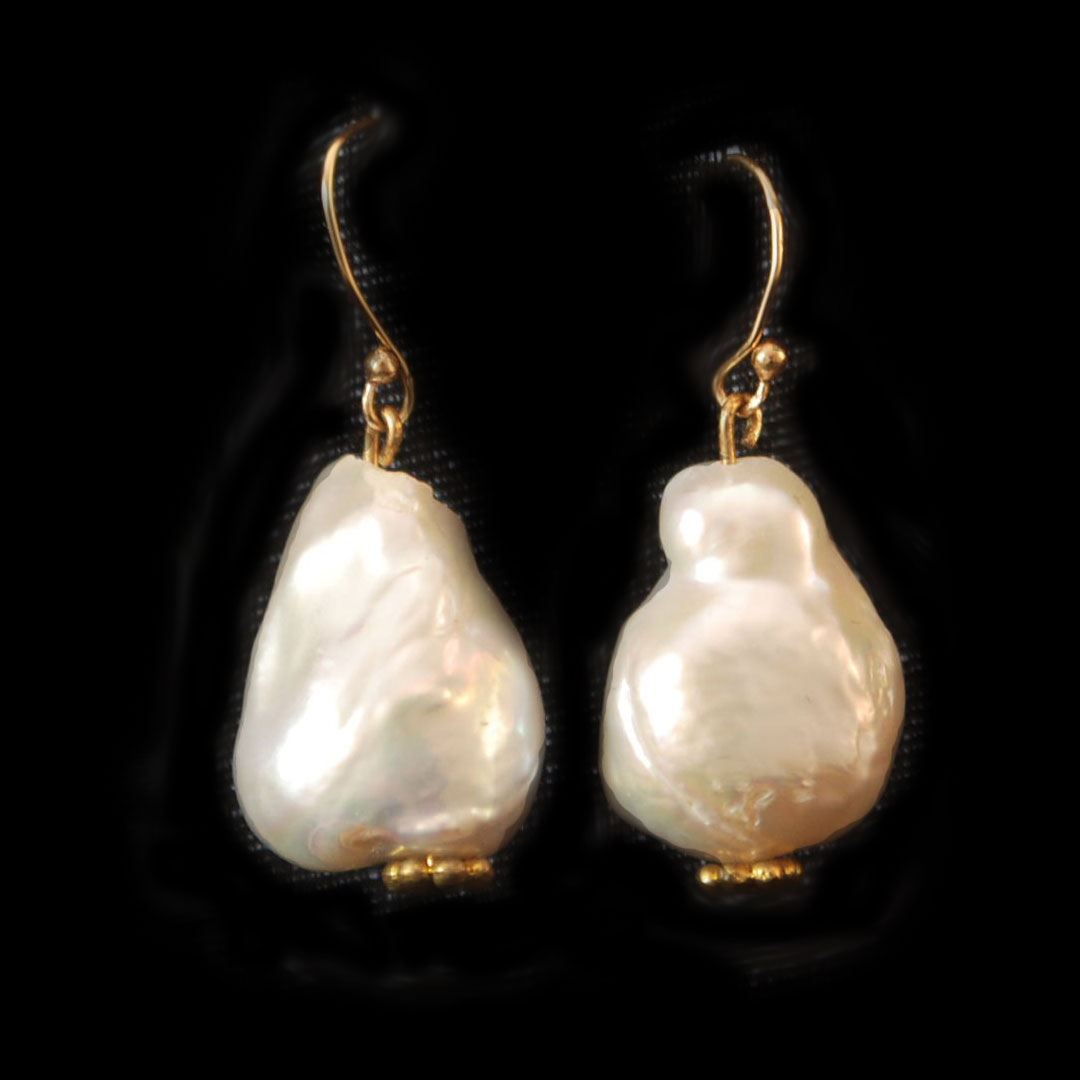
This Yarn is bulky so I like to knit on a size US 10 but you can knit on any size! Thats the beauty of Art Yarn. The cotton, acrylic, wool blend is based on Marsala PANTONE 18-1438. Covered in garnet colored crystal, freshwater pearls, semi precious carnelian, silk ribbons, gold fibers and some gorgeous other found objects. The inspiration came from Byzantium’s vibrant and energetic color palette jewel tones of red and gold with the pop of white pearls. Woven on a very strong nylon cord.

Bulky – Marsala Handspun Art Yarn
Approximately 31 yards, weight 4.8oz
3-4 WPI

24k Gold Filled Garnet Wire Wrapped Bracelet image 0

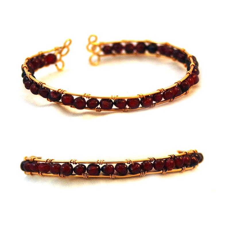
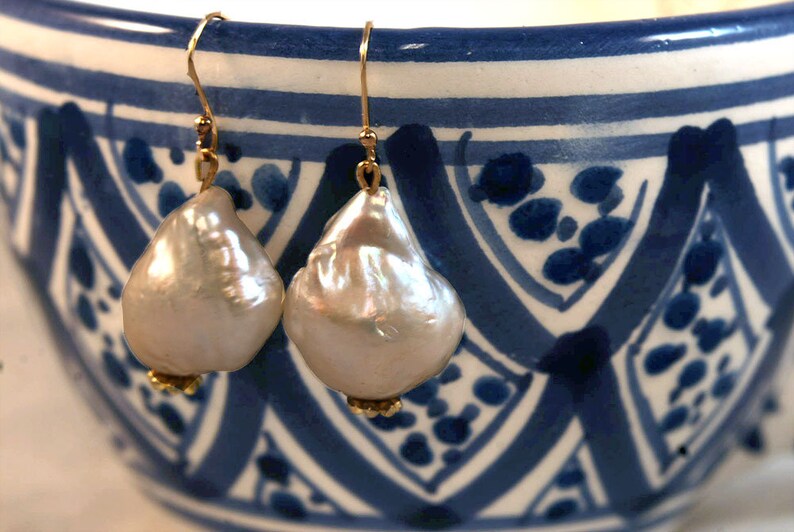
Here is another Marsala example of the deep tones of red brown in this 24k Gold Filled Garnet Wire Wrapped Bracelet. Deep red purple color gemstone. For my other graphic design resources check out my category archives graphic section 

24k Gold Filled Garnet Wire Wrapped Bracelet

  • Wire molds to wrist one size
  • 5mm grade C Natural Garnet
  • By Nancy Tranter

Color of the Year for 2014: PANTONE 18-3224 Radiant Orchid

 Expressive, exotic 18-3224 Radiant Orchid blooms with confidence and warmth

Pantone, an X-Rite company and the global authority, today announced Color of the Year PANTONE® 18-3224 Radiant Orchid, a captivating, magical, enigmatic purple, as the color of the year for 2014. “While the 2013 color of the year, PANTONE 17-5641 Emerald, served as a symbol of growth, renewal and prosperity, Radiant Orchid reaches across the color wheel to intrigue the eye and spark the imagination,” said Leatrice Eiseman, executive director of the Pantone Color Institute®. “An invitation to innovation, Radiant Orchid encourages expanded creativity and originality, which is increasingly valued in today’s society.”


“An enchanting harmony of fuchsia, purple and pink undertones, Radiant Orchid inspires confidence and emanates great joy, love and health. It is a captivating purple, one that draws you in with its beguiling charm.” Download the Pantone report for spring 2014

hue map and color details for radiant orchid 18-3224

hue map and color details for radiant orchid 18-3224
Bracelet Radiant Orchid Mix Gemstones Memory Wire Wrap $45.00
Handspun Bulky Textured Art Yarn Radiant Orchid Purple Amethyst Crystal Beaded
Artisanal Yarn available at nancystoreonline.com
pantone color of the year radiant orchid color analysis
Pantone color of the year radiant orchid color analysis

I’m excited by radiant orchid because this fuchsia pinky purple is one of my all time favorite colors! I’ve collected several radiant orchid beauty pieces to share with you.

Radiant Orchid as Interior Design

This color of the year is bold, inspiring and fueled with adventure, its showing up on runways and into living rooms across the nation. Individuals drawn to this color are known to be imaginative, creative and original. While this bright hue may not be suited for the faint at heart, don’t feel intimidated to try it out, as it evokes sophistication and confidence. Bright colors like this can pop a punch into your everyday style you can try infusing the color into your look by painting your nails or tie your ensemble together with an orchid bracelet. My store nancystoreonline.com offers a variety of jewelry pieces, all accented with sparkling semi-precious gemstones. So whether you’re putting together an outfit, or combining it into other aspects of your life, remember to get inventive and have fun with it!

source: procato,pantone, L.Eisman #coloroftheyear #pantone #radiantorchid #orchid #graphicdesign

The Halloween Theme Party Plan to The Enchanted Black Forest

Forests can be spooky and mysterious places. There are a lot of strange noises and things can be seen moving out of the corners of people’s eyes in forests. The enchanted forest theme works well with Autumn. When it comes to famous forests perhaps none comes close to the Black Forest in Germany.

As I look at my Grandmother’s chachka they remind me of her stories of the Black Forest. Her oversized wooden spoons along with figurines of black bear carvings made from walnut. They took on a life of their own when we were little. The Black Forest is a mountainous region in southwest Germany, bordering France. Known for its dense, evergreen forests and picturesque villages, it is often associated with the Brothers Grimm fairy tales. This book is great for the kids during Halloween. The area is renowned for its spas and the cuckoo clocks produced in the region since the 1700s. The region’s largest town, Freiburg, is filled with Gothic buildings and surrounded by vineyards. It was the failure of the vineyard in the 1890s that propelled my family to immigrate. When the Great Wine Blight hit in the mid-1890s, the culprit turned out to be a pest called Phylloxera that would forever alter wine production and the fate of my family. Great great maternal grandmother Katerina Fink picked up her cuckoo clock and 2 surviving children then left for the lower east side of New York.

This season’s celebrations will have a bit of family history infused into it pulling from the decor and motif from the Black Forest. This is a nice updated spin on the Fairytale Forest party ideas.

Photos Below: The Forest archway or entranceway is an important place to decorate. This is your guests first experience with your theme so make it a statement

The archway or entranceway is an important place to decorate. This is your guests first experience with your theme so make it a statement
Andersons decore store: The archway or entranceway is an important place to decorate. This is your guests first experience with your theme so make it a statement
Dolce Gabanna 2016 show: The archway or entranceway is an important place to decorate. This is your guests first experience with your theme so make it a statement
Interior design inspiration from the region and culture of the Black Forest sources for purchase listed at the end of post

The Enchanted Forest party theme is very popular. Everyone is going crazy for this fun theme because it’s so versatile. Enchanted Forest themes can be mysterious, magical, dreamy, elegant, haunted, or any combination you want. Whichever way you go with for your age group, here are the fundamental elements you’ll need to create an amazing Forested theme for your parties. You can’t have this party without trees, but what you choose and how you arrange them are totally up to you. To add depth to your area, try tree background silhouettes or tree murals to display against the back wall. Then, fill in your forest with whatever trees help you achieve the effect you want. Tree theme props and wire trees can help add a magical look to a fairy tale or winter wonderland scene. Tree cutouts can add the perfect finish to create a haunted forest look.

Interior design inspiration from the region and culture of the Black Forest sources for purchase listed at the end of post
Premium Shellfish Delivered! SAVE 5% On Wild & Delicious Premium Shellfish From Vital Choice  Wild Seafood- Get Free Shipping On Orders $99+ - Use Code: 1VCAF5 At Checkout! Shop Now!
Interior design inspiration from the region and culture of the Black Forest sources for purchase listed at the end of post

Where ever you make your starting point with your Forest theme, you will soon be hooked by the beauty and mystery that Forests have to offer.

Download mSpy Today.

sources: Andersons , DG, Disney, Better Homes and Gardens, Relatives from Baden-Württemberg, Germany, hyggeandwest.com, Etsy

Color Trend Secrets You Didn’t Know About: Fall 2013

Fall 2013 Color Trends invokes colors that are rustic, warm but bright and dull all in one. It speaks of some of our favorite shades. The fashion color report for Fall 2013 has been unveiled by Pantone LLC. This vivacious palette gives us a direction to the overview of designers’ use of color in their upcoming collections. 

color trends palette suggestions by Graphic Designer Nancy Tranter

Released on the first day of New York Fashion Week, the PANTONE Color Trends Report features the top 10 colors for women’s and men’s fashion for fall 2013, along with designer sketches, quotes, and headshots. The colors come together to create moods that range from sophisticated and structured to lively and vivid. They encapsulate our inherent need for wardrobe variety to reflect emotions that run from thoughtfully introspective to irrepressibly elated.

Multifaceted Emerald continues to sparkle and fascinate, bringing luxury and elegance to the palette, while yellow-toned Linden Green brings a lightness to the deeper shades of fall. Try pairing both with Mykonos Blue, a bold, meditative blue, for a classic and relaxed fall look. Exotic Acai adds mystery to the palette. Pair the elegant shade of purple with Emerald for a regal disposition, or spirited Samba red for an expressive and dramatic look. Koi, a decorative orange with dazzling and shimmering qualities, is a statement color that serves as a pick-me-up for your wardrobe. Vivacious, an unruly and wildly deep fuchsia, adds an ebullient sensuality to the palette.

Press Release
PANTONE 17-5641 Emerald
PANTONE 18-4434 Mykonos Blue
PANTONE 15-0533 Linden Green
PANTONE 19-3628 Acai
PANTONE 19-1662 Samba
PANTONE 17-1452 Koi
PANTONE 18-0312 Deep Lichen Green
PANTONE 19-2045 Vivacious
PANTONE 19-4215 Turbulence
PANTONE 19-1116 Carafe

Graphic Designers Resource for download: ASE Fall 2013 Color Trends Pantone Swatches

I started using ASE (or Adobe Swatch Exchange) swatches working at a Graphics Print House in Chelsea, New York a few years back. I now use ASE swatch libraries for most of my client’s projects. 

So what are ASE Swatch Libraries? ASE’s are customized color palettes in which you choose colors and export them to an original file format called ASE from Illustrator for future use in Illustrator, InDesign or Photoshop. Importing the ASE files works very much like importing any other color swatch such as the preset Pantone® colors. Once imported the swatch will give you a dialog box palette window to hold your colors.

color trends studio of fashion designer

Import a ASE Color Swatch into Illustrator:

  1. In an open or existing document click the drop down arrow on your Swatches Palette.
  2. Select “Open Swatch Library>Other Library.
  3. Select the ASE file you would like to import and click open.
  4. A new palette box will appear with your imported colors.

For my other graphic design resources check out my category archives graphic section 

What (Really) Goes Into Homemade Natural Deodorant That Works

Making your deodorants and perfume allows you to blend your favorite scents to develop a signature perfume all your own.

Here is a natural deodorant recipe that I have been playing around with

Natural Deodorant Homemade Ingredients Recipe - Nancy Tranter

Ingredients

3 Tbls rosemary antioxidant in olive oil
3 Tbls arrowroot
2 Tbls  baking soda
2 Tbls kokum butter
1 Tbls Beeswax
1/2 Tsp emulsifying wax
4 small gells of vitamin e

essential oils (tea tree) I used 20 drops but you can use less for sensitive skin

Tea Tree may be the hands-down most popular antibacterial essential oil. Lavender essential oil is an antibacterial and anti-inflammatory (AND stress reducer, especially for kids), and is helpful in the healing of small burns, cuts, and insect bites, don’t use if pregnant. When more serious antibacterial action is necessary, natural medicine professionals turn to Oregano essential oil. Also a highly-regarded antibacterial, but with gentler action and scent, a Geranium essential oil is a very worthwhile addition to the home medicine chest. The ‘old stand-by’ of Lemon should not be overlooked when searching for ways to convert your home to a healthy ‘green’ lifestyle. My Personal favorite yet it is a little pricey is Rose Otto, Rosa damascena, also known as Damask rose. I discovered this little less known antibacterial from my travels to Turkey. they are the main producer with approximately 10,000 tonnes of flowers grown annually for essential oil production. It is anti-inflammatory and cooling to skin conditions such as rosacea, tones capillaries, and fights to age with antioxidants. I currently get my rose absolute from lalaessentialoils.com

Preparation for Natural Deodorant

microwave in a glass measuring cup for 30 seconds and stir. If not melted microwave for 15-second intervals until blended. Warm and fused liquid suspension is what you want. Don’t microwave too long or hot you don’t want to burn off the essential oil of rosemary extract.

ONLY add essential oils and vitamins after heating. Store in a cool place, I use my refrigerator.

Here is a natural deodorant recipe that I have been playing around with

What deodorants have aluminum?

Aluminum isn’t normally found in deodorants. Most antiperspirants, on the other hand, do contain aluminum. Two-in-one products — meaning they’re both a deodorant and an antiperspirant — will also include aluminum. Aluminum from antiperspirants may build up in breast tissue after years of use. Aluminum does have the ability to disrupt your endocrine system, but there’s no scientific evidence to show that aluminum from antiperspirants causes breast cancer. More research is needed.

For my other graphic design resources check out my category archives graphic section 

material source: mountainroseherbs.com, nuts.com, RibbiRue, Healthline.com, lalaessentialoils.com, some links in this article are Amazon affiliate links. That means if you click on them and make a purchase, I earn a small commission. This costs nothing extra for you but does help me afford to keep doing what I do. (Thank you!) 

Emerald 17-5641 is the Color of the Year for 2013

“Lively. Radiant. Lush… A color of elegance and beauty that enhances our sense of well-being, balance and harmony.”  PANTONE 17-5641 Emerald is the Color of the Year for 2013.

Emerald 17-5641 the Color of the Year 2013 Hue Map and Color Details

Pantone announced the choice for color of the year for 2013 to #17-5641 – Emerald Green. The name was first used centuries back, in 1598. This green tone got its name after the emerald gemstone. The color was popular in the 1800s when artists have used it as paint. There are stunning examples of the color in artwork by Van Gogh, Monet, and Cezanne. The problem at that time was that the color contained arsenic which caused many health issues. Luckily today, emerald green is safe to use. Emerald will have a tremendous influence on fashion, beauty, interiors as well as weddings! A color that last peaked in the ’80s, Emerald Green has been making a comeback over the past few years.

“Green is the most abundant hue in nature — the human eye sees more green than any other color in the spectrum,” Leatrice Eiseman, executive director of the Pantone Color Institute, said in a statement “It’s also the color of growth, renewal, and prosperity — no other color conveys regeneration more than green. For centuries, many countries have chosen green to represent healing and unity.”

Below is my personal color breakdown for Emerald. When I’m working on site for a large company I often reference my own blog for quick color choices. The work that the following graphic would help me with is branding, logo choice color, website color scheme, and additional printed collateral.

Emerald 17-5641 the Color of the Year 2013 Hue Map and Color Details
Hand Dyed Emerald Ribbon and Silver Chain necklace
$35.00
Emerald Cut Swarovski Crystal and Goldtone Earrings
$42.00
Emerald Necklace, Gold Plated Rolo Chain, Czech Glass Cathedral beads, Vermiel Beads $45.00

For my other graphic design resources check out my category archives graphic section

Color of the Year Emerald with Interior Design

Marsala Artisanal Art Yarn and How to Have Fun with it

Marsala Artisanal Art Yarn is a one of a kind art yarn that I spun. The cotton, acrylic blend is based on Marsala PANTONE 18-1438 

The thick and thin art yarns look amazing in finished products! There are so many things you can do with artisanal art yarn. Create wall art with yarn or how about yarn art on canvas?


Marsala Red Artisanal Bulky Textured Beaded Art Yarn

Hand spun core spinning is a slow spinning technique which results in Artisanal Art Yarn looking very different from a traditional single. The fibers are allowed to wrap around a core thread at a 90 degree angle, it allows the spinner to create a very strong, soft, warm and lofty yarn. however due to the longer time it takes to create a Core spun yarn the cost is higher.

3 Tips for Corespinning Yarn

  1. keep your core-spun yarns smooth and fine by using a lightly textured art batt.
  2. To increase the texture, you can go wild with locks and embellishments.
  3. Changing the core threads to hemp, wire, or elastic provides even more avant-garde opportunities in your handspun.
  4. I prefer core spinning in threads that are strong enough to be put under tension without breaking, and they can take a lot of twist without a struggle. Hemp, crochet cotton, loop mohair, fishing wire, thick poly thread 3mm.

Marsala Artisanal Art Yarn is bulky I like to knit on a size US 10 but you can knit on any size! Thats the beauty of Art Yarn. The cotton, acrylic blend is based on Marsala PANTONE 18-1438. Covered in garnet colored crystal, freshwater pearls, semi precious carnelian, silk ribbons, gold fibers and some gorgeous other found objects. The inspiration came from Byzantium’s vibrant and energetic color palette jewel tones of red and gold with the pop of white pearls. Woven on a very strong nylon cord.

Marsala Art Yarn with Kilim
Marsala Artisanal Art Yarn spinning wheel Louet S10 nancystoreonline.com
Spinning Wheel with Art Flyer Louet S10

Baroque Pearl Drop Gold Earrings Inspired from Girl with a Pearl Earring Johannes Vermeer Paintings

Baroque Pearl Drop Earrings Large 24k Gold Vermeil Earring Nancy Tranter

Large white freshwater pearl drop earrings inspired by vermeer’s girl with a pearl earrings is an exceptional recreation of an exceptional earring.

These baroque pearl drop earrings were made famous by the 2003 Lions Gate film by the same name, Vermeer’s Girl with a Pearl Earring painting is a very well-known historical image in modern times. The film is based from Tracy Chevalier’s 1999 historical novel Girl with a Pearl Earring. The hard-to-come-by colossal white pearl drop is a rare find. Truly breath-taking…the perfect reproduction earrings for any occasion. A great pair of high-quality earrings that would express the elegant simplicity of the 17th century as seen in Vermeer’s picture, but would also be suitable for wear by a 21st-century woman.

(Baroque Pearl Drop Earrings) Girl with a Pearl Earring Johannes Vermeer dated c. 1665


The painting Girl with a Pearl Earring (Dutch: Het Meisje met de Parel) is one of Dutch painter Johannes Vermeer’s masterworks and as the name implies, uses a pearl earring for a focal point. Today the painting is kept in the Mauritshuis gallery in the Hague. It is sometimes referred to as “the Mona Lisa of the North” or “the Dutch Mona Lisa”. It will be on tour at the De Young Museum in San Francisco in January-June 2013.

Available at nancystoreonline.com

The portrait is the first work scanned by Hirox‘s high-resolution microscope. Beginning in 2018 scientists generated an ultra-high-resolution panoramic image consisting of 93,205 x 108,565 pixels. These pixels came from the creation of 9,100 different scans. The scanner’s technology was also capable of three-dimension close-ups. The result was ten sections of high-quality resolution that historians could explore Vermeer’s painting technique. It is the first 10 billion pixels panoramic image of a painting.

Baroque Pearl Drop Earrings
* size .875 inches or 22.2 mm, width is 0.625 of an inch or 15.875mm
* weight 3 grams each. Total of 30 carats
* vermeil findings (24k gold over sterling silver)
* by Nancy Tranter
nancystoreonline.com

to see more in depth information about my jewelry check out jewelry

PHOTOSHOP TUTORIAL Toning With Duotones, Tritones And Quadtones

This is a great little tutorial from 2011 running adobe photoshop CS6. I love keeping this dated stuff around. Times have changed and the facade has moved along but the math remains the same. The tutorial holds up to the standards of today. Toning With Duotones, Tritones, and Quadtones. This tutorial will teach you how to create duotones, tritones, and quadtones inside Photoshop.  

tutorial supplies latest adobe photoshop tools
the latest up tp date graphic design tools

At the end of the photoshop tutorial, you’ll find a link to 5 custom duotone/tritones as a complimentary download. These colors are based upon Pantone Fall fashion report 2011. Your photograph must first be converted to black and white. One of my favorite methods to convert to BW is using ‘calculations’. Open your photograph and click on the image, then calculations.

photoshop tutorial calculations


The calculations dialogue box opens. There are four areas to focus on in the ‘calculations’ dialogue box. The two channels, the blending mode, and opacity settings. I usually combine the ‘red’ and ‘green’ channels. The ‘soft light’ blending mode is great for evenly toned BW. The ‘screen’ blending mode is good for high-key BW. You will need to alter the opacity setting to suit your photograph. Anywhere between 20-100%.

dialog box for calculations to duotone and tritones

When you have the settings the way you want them, click ‘OK’. There are two further steps required to create your grayscale image. After you click ‘Image-Mode-Grayscale,’ a dialogue box will open up, asking if you want to discard color information. Click ‘Ok.’

image dialog box grayscale mode

After clicking on Image-Mode-Duotone, the ‘Duotone’ dialogue box will open.

dialog box for image duotone mode
dialog box for image duotone options mode

The drop-down box at the top left allows you to specify how many colors you will use to tone your image. There are three choices; duotone, tritone, or quadtone. Two of the great advantages of duotones are the ability to ‘load’ existing presets, as well as create your own. There are 5 of my custom duotone/tritones available as a complimentary download. Loading duotone pre-sets is simple. Click ‘load’ in the duotone dialogue box. If you have never used duotones before, Load your custom duotone/tritones into Adobe Photoshop/Presets/Duotones folder. To create & save your own custom duotones, click on one or more colors in the duotone dialogue box.

dialog box for naming your colors found in image duotone options mode

Either the ‘color picker’ or ‘pantone’ color boxes will appear. Choose the color you want and click ‘Ok.’

dialog box for naming your colors found in image duotone options mode

You can continue this process to change more colors. You can also change the spread of any particular color by clicking in the ‘curve’ area. By playing around with the curve you will control the spread of color.

dialog box for adjusting curves found in image duotone options mode

When finished in the ‘duotone curve’ box, click ‘Ok’. Then click ‘save’ in the duotone box to save your custom duotone into your own pre-sets folder. I finish up my Duotone/Tritone by adding a ‘Curves’ adjustment layer.

photoshop tutorial image adjustments curves

When finished in the ‘duotone curve’ box, click ‘Ok’. Then click ‘save’ in the duotone box to save your custom duotone into your own pre-sets folder. I finish up my Duotone/Tritone by adding a ‘Curves’ adjustment layer.

photoshop tutorial image adjustments curves

In order to save your file as a JPG, you will need to convert back to RGB color. that’s it, all done.
a download of my duotones can be found in my link section to the left.

Check out my graphic design blog archives here

Check out my graphic design portfolio here

Earrings Cloisonne Gold Cathedral Glass and All About How They are Made

Earrings cloisonne gold, green, Czech fire polished glass cathedral gold plated Buy it here at my store

The riches from Eastern Europe’s history are major draws for art history buffs, students of royal culture, and, archeologists. While the possession of these treasures from the past by individuals was often the result of gigantic gaps between the peasantry and the ruling families, their beauty, design, mystery, and provenance of Eastern European riches keep us curious. In this photograph we have Cloisonne gold earrings.

Earrings cloisonne honeysuckle, gold, green, Czech fire polished glass cathedral gold plated $20.00

Cloisonné is an ancient technique for decorating metalwork objects, in recent centuries using vitreous enamel, and in older periods also inlays of cut gemstones, glass, and other materials. The resulting objects can also be called cloisonné. The decoration is formed by first adding compartments (cloisons in French) to the metal object by soldering or gluing silver or gold wires or thin strips placed on their edges. These remain visible in the finished piece, separating the different compartments of the enamel or inlays, which are often of several colors. Cloisonné enamel objects are worked on with enamel powder made into a paste, which then needs to be fired in a kiln. The technique was in ancient times mostly used for jewelry and small fittings for clothes, weapons, or similar small objects decorated with geometric or schematic designs, with thick cloison walls. In the Byzantine Empire techniques using thinner wires were developed to allow more pictorial images to be produced, mostly used for religious images and jewelry, and now always using enamel.

Created by skilled artisans, each cloisonne bead can take up to four hours to produce. Dozens of tiny cells are arranged on the bead’s surface, filled with enamel color, and fired. Then each bead is polished, revealing intricate and beautiful designs. Due to the handcrafted nature of the beads, size, shape, and colors may vary this one here is made this one here is honeysuckle, gold, green 10mm. Czech fire-polished glass beads have faceted sides and intricate metallic, enhanced detailing on the top and bottom. Each of these is a treasure in itself and add exquisite charm this one here is transparent gold, 8mm cathedral Gold Plated Surgical Steel Earwire

for more info check out my other jewelry articles

Earrings Cloisonne Gold

* Approx. length: 2.00”, 50.8mm
* width: 0.4″, 10mm

nancystoreonline.com