Gorgeous, Handmade Pre-War Vintage Japanese Beer Advertising Posters

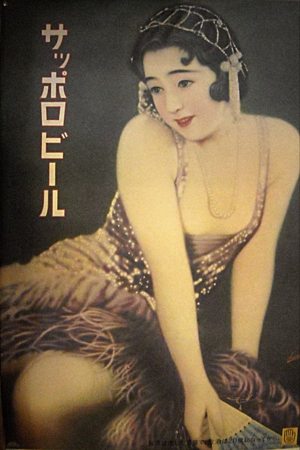
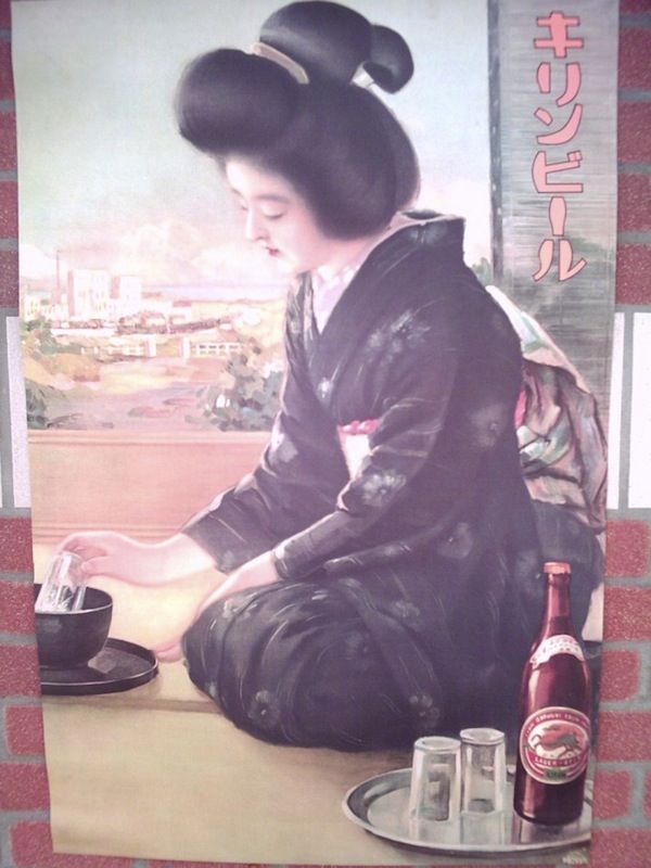
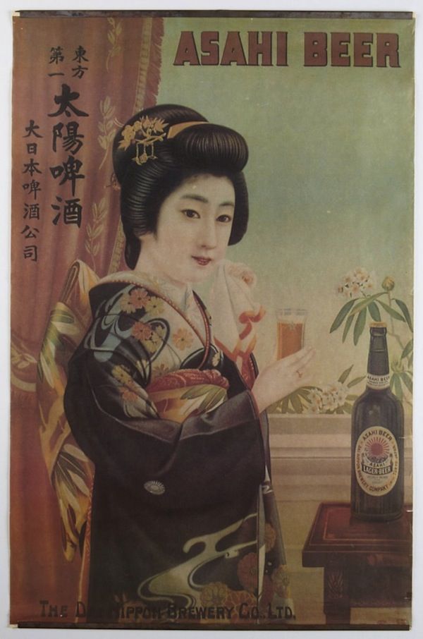
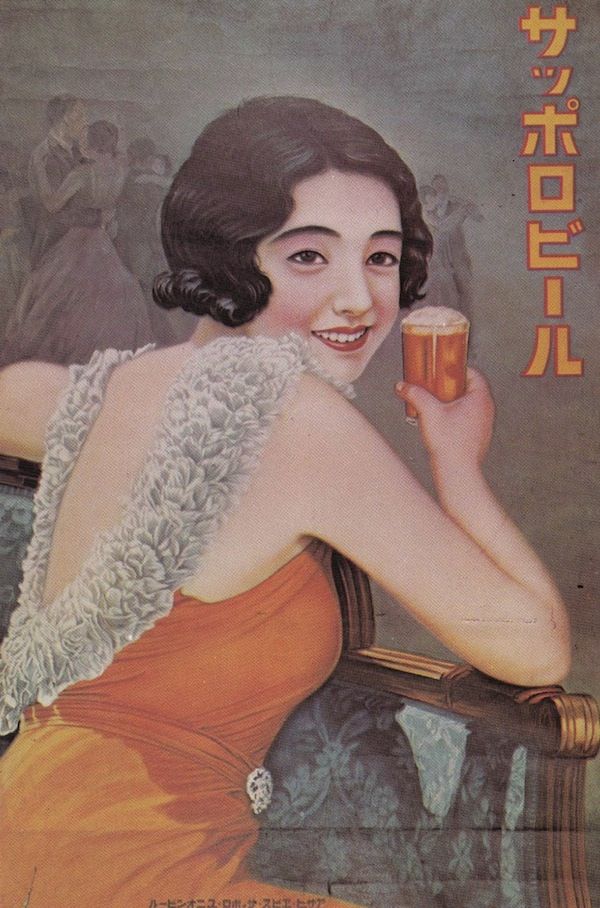
Gorgeous, Handmade Pre-War Japanese Beer Posters Feature Lovely Vintage Images 

Recently a treasure trove of unearthed vintage advertising posters of gorgeous pre-war Japanese beer is discovered. In order to catch the eye of the audience Japanese beer companies had to use colorful posters. The posters are drawn, painted, and lettered by hand. The craftmanship took hours and the skill level was very high. While beer companies like Asahi, Kirin, and Sapporo are not known for their richly flavored malted products during that era, they are recognized for their richly evocative imagery used on their posters and postcards. If you spend enough time studying these posters carefully, you will realize that these brands often have the same girls featured on their posters, donning a different outfit.

Japanese Advertising History: Advertising is a window into society and people

Vintage advertising posters can be found at the Ad Museum Tokyo. Here the museum provides a good overview of the Showa Period 1926-1945 https://www.admt.jp/en/ A robust market now exists for these antique pieces of advertising and their suitable-for-framing reproductions.

Showa Period in Advertising 1926-1945

From the early days of Showa to the end of the war 1926〜1945 Continuing from the Taisho period, the early Showa period was referred to as “Showa Modern.” Advertising expression became more international and polished. As European and American cultural influences pervaded Japan, Japanese advertising became more refined, shifting toward tones of internationalism and modernism. At around this time the urban residents began enjoying the new customs and lifestyles that were introduced as people absorbed Western culture. Advertising communicated this change to a more enjoyable urban culture. This enjoyment drastically changed with the approach of war. Japanese advertising entered its “time of winter” as advertisements for regular products were swiftly replaced by promotions designed to boost national morale.

Pua shell Necklace by Nancy Tranter
Handmade Pre-War Vintage Japanese Beer Advertising Posters girl with purple dress and fan sitting
Handmade Pre-War Vintage Japanese Beer Advertising Posters girl kneeling black kimono
Handmade Pre-War Vintage Japanese Beer Advertising Posters girl standing multi color kimono asahi beer

Source: Ad Museum Tokyo, Boing Boing, Colin Marshall, Melissa Goh #japanese #BeerPosters #vintageadvertising #handpainted #vintageadvertisingposters #handmade #showaperiod

Graphic Design Cooper-Hewitt immersion escape room where you can make your own wallpaper

Immersion Room using digital and projection technologies

This exhibition makes you feel like a genius. The Immersion Room on the second floor uses digital and projection technologies to bring the museum’s collection of wallcoverings, the largest and most notable in North America to life. Visitors who come to the Cooper Hewitt Museum receive an interactive pen, an all-access pass to the world of design. Visitors use the pen to copy any object in the museum and save it to their collection or experiment with creating their own designs.

http://www.cooperhewitt.org/events/opening-exhibitions/immersion-room/

CHM Press release- “This interactive space, formerly Margaret Carnegie’s bedroom, offers a unique experience: the ability to view Cooper Hewitt’s extraordinary collection of wallcoverings as never before.
You can select wallpapers from the Museum’s permanent collection and see them projected on the walls from floor to ceiling—for a vibrant, impactful, immersive sensory room experience. You can even play designer by creating your designs, or just stand back and watch as the wallpapers unfold across the immersive room.
More than just entertainment, the Immersion Room provides the first opportunity to discover Cooper Hewitt’s wallcoverings as they were intended to be viewed.

A damask-style sidewall design called “City Park” (2007) that contains strikingly modern imagery, including
a fire hydrant, parking meter, pigeons and rats

To complement the experience, several wallpapers are accompanied by audio clips. When you select one of these designs, an audio recording plays through speakers in the room, giving you additional information about that particular design or designer.

The experience is yet another way the new Cooper Hewitt is remaining true to the vision of its founders, Sarah and Eleanor Hewitt, who intended it as “a practical working laboratory,” where students and designers could be inspired by actual objects. Their 1897 vision of a museum and collection “for anyone who wanted to use it as a place to work and learn” seems radical, even by today’s standards, but it has guided the transformation of Cooper Hewitt into a design museum for the 21st century.”

Check out some of my favorite wallpapers and where to buy them on my pinterest

Check out my graphic design blog archives here

Check out my graphic design portfolio here

Source: Cooper Hewett Museam, The Immersion Room is made possible by major support from Amita and Purnendu Chatterjee.

3 Great Articles About Iconoclasm the Power of Images

Byzantine Iconoclasm and the Jansen Art text that we have all read gives a though account of the 9th century iconoclasm, but hearing modern examples of this recurring historical problem brings a fresh insight and new thoughts on the topic. Read the stories of Saltz, Griffin & Anderson authors who I have found to successfully represent a modern view of iconoclasm.

 “The horrific paradox then is that these killers believe in the power and divinity of images, art, and architecture more than those who make the objects and who see what they make as abstract representations of ideas and things.”

Jerry Saltz

Here is the link to the article that I liked http://ow.ly/HfBOH Iconoclasm Now: CharlieHebdo and the Lethal Power of Art by @jerrysaltz

What is an example of iconoclasm?

Iconoclasm literally means “image breaking” and refers to a recurring historical impulse to break or destroy images for religious or political reasons. For example, in ancient Egypt, the carved visages of some pharaohs were obliterated by their successors; during the French Revolution, images of kings were defaced.

Byzantine iconoclasm 9th century
byzantine iconoclasm 9th century

‘Iconoclasm may even aid those who would benefit from cultural amnesia, under the guise of moving on’

Darran Anderson

Here is another great link to an article about Irish Iconoclasm: Body of evidence: a history of Irish iconoclasm 28 JUNE 2019 BY DARRAN ANDERSON 

Irelands murals, traffic Routes into Derry

Breaking an image does not eradicate it; it merely replaces it with another. Destruction is part and parcel of creation. Treasures from East Anglian Churches demonstrated just this fact: cruelly mutilated artworks had transformed into powerful warnings against the latent violence of political and religious dogma.

JONATHAN GRIFFIN

Here is another great link to an article about Modern Iconoclasm: The seeds of destruction Art Under Attack: Histories of British Iconoclasm at Tate Britain by JONATHAN GRIFFIN

Douglas Gordon
Self Portrait of You + Me (David Bowie) 2007
Burnt photograph, mirror 632 x 530 mm
© Douglas Gordon, courtesy Gagosian Gallery
Douglas Gordon
Self Portrait of You + Me (David Bowie) 2007
Burnt photograph, mirror 632 x 530 mm
© Douglas Gordon, courtesy Gagosian Gallery 

Typography: “Star Wars” its Origins Coming from Helvetica

What does Star Wars and Helvetica have in common? More than you might realize.

The original designer of the Star Wars logo Suzy Rice, based her work on a modified version of Helvetica Black.

In the words of professional visual artist Suzy Rice- “The cover of that book pictured here to the left bears a reprint of the logo that I designed and drew, after it was redrawn by Lucasfilm, Ltd. (I believe that was done by Joe Johnson) with the flat-bottom “W” and the outline emboldened — both done by Lucasfilm, so it was explained to me by Producer Gary Kurtz, to improve readability of the logo in the main titles of the film (and all the rest that followed).

My logo was redrawn with some modifications but it was never replaced with a new design; or, more specifically, no “new design” was done by Johnson, he simply modified my design for predominantly production quality requirements when applied to the big screen.

Gary Kurtz called me at my work after they’d accepted my logo design for advertising purposes and informed me that he and George were going to use (my) logo, rather than the one they’d been up-to-that-point trying to use in the ongoing production of the film prior to release. My logo read better (was easier perceived by the viewer during the animated title treatment) than the one they’d originally intended to use but my logo required a bolder outline and a flattened W to improve on screen legibility during that quick pan (animated treatment) in the main titles. My response was great!”

Star Wars #1 - signed Carrie Fisher - Marvel Treasury Comic
$11,631.77 Only 1 available
Star Wars #1 – signed Carrie Fisher – Marvel Treasury Comic $11,631.77 available

Graphic Design Girl Power

Finding out one of my childhood beloved movies also had a lead female graphic designer was a source of inspiration for me as I was learning design.

Fernando de Carabassa

These typographic Star Wars posters reimagine a galaxy far, far away in the style of Massimo Vignelli.

As these vivid typographic posters by Argentinian designer Fernando de Carabassa display, Helvetica and Star Wars might be a match made in heaven. It’s hard to put in words why this works. Thanks to that iconic title crawl, Star Wars is now famously recognized as using large blocks of clean text. It feels like a logical continuation to use colorful blocks of Helvetica to expand those title crawls into Word Art. De Carabassa’s designs use laid-out blocks of text and solid colors to evoke the imagery of the first three Star Wars movies: everything from the sight of two suns rising over the planet of Tatooine, to the crackle of a lightsaber igniting, to the barren, ice-cold world of Hoth. Star Wars, Helvetica, and typography might not be exactly related ideas in most people’s minds, but perhaps they should be.

Fonts similar to Helvetica: Free Alternatives & Similar Fonts

  • Inter
  • Roboto
  • Arimo
  • Nimbus Sans
  • TeX Gyre Heros
  • Work Sans
  • IBM Plex Sans

source: Massimo Vignelli, suzyrice.com, fastcompany.com, learnui.design

Aquamarine Color of the Year 2015

Here we have Aquamarine Color of the Year schemes, paints, palettes, combinations, gradients and color space conversions.

Pantone’s Aquamarine hexadecimal color code is #9dc3d4 this is a medium light shade of cyan. In the RGB color model #9dc3d4 is comprised of 61.57% red, 76.47% green and 83.14% blue. In the HSL color space #9dc3d4 has a hue of 199° (degrees), 39% saturation and 72% lightness. This color has an approximate wavelength of 484.57 nm. The lead color for women for the Spring/Summer 2015 season, PANTONE 14-4313 Aquamarine is an airy blue with a dreamy feel. Cool and calming, ethereal Aquamarine is a shade with a wet and watery feel.

Aquamarine Color of the Year schemes, paints, palettes, combinations, gradients and color space conversions

Matching Digital Colors to Actual Paint Colors

Have you ever seen the perfect color on your wanderings? Your next project is how to translate the color you found into interior house paint. I am asked as a designer to select paint colors for my clients based on a digital image emailed to me or found on a website. Factors like scale, lighting, reflection and existing items influence color selection making it a multi-step task. So how do you start? Let me share my findings for Aquamarine. Here is the closest match that I approve of 249-2 VERSAILLES Valspar Interior Paint.

Matching Digital Colors to Actual Paint Colors Pantone Aquamarine 249-2 VERSAILLES Valspar Interior Paint.

Calm, cool, and delicate, warm tones describe the color trends this spring 2015 season, as mother nature brings so much beauty and a sense of relaxation. A relaxing and airy theme that Aquamarine Blue carries, washes away those winter blues and reinvents a new you; away from cold and into the sunshine. 

An invigorating and powerful Scuba Blue that brings along the fun, resembles the clear waters of Greece. This cool shade brings you to paradise or at least makes you feel as though you are there, if you have been dreaming of Spring to finally be here.

Bracelet Radiant Orchid Mix Gemstones Memory Wire Wrap
$45.00 nancystoronline.com
Aquamarine Crystal Bracelets available nancystoreonline.com

The reflection of the faceted beads is stunning. You will stand out with this bracelet because of its visual impact of colors and materials. These bracelets consist of a memory wire that wraps around your wrist. Different materials for this bracelet include Sterling silver beads and bead caps. Gemstones, Swarovski faceted beads that are fire-polished, freshwater pearls, glass round and faceted beads, acrylic beads. Fits almost any wrist size.

check out my graphic design section for more indepth information

Let Zac Posen Be Your Inspiration for Living Room Paint Colors

Apartment in Washington Square 2015 photo by Zac Posen

Sit back and enjoy these beautiful living room paint colors

The above living room paint colors are examples from fashion designer Zac Posen. Zac became known for his glamorous ball gowns and has dressed everyone from Rihanna to Sarah Jessica Parker to Oprah Winfrey. He was raised in SoHo, Manhattan, New York. He has previously stated that his love of fashion began when he used to steal the yarmulkes at his grandparents’ synagogue because he wanted to make dresses for dolls. At 16, he enrolled in Parsons School of Design’s pre-college program, and he was given the opportunity to intern with fashion designer Nicole Miller. On November 1, 2019, House of Z and Z Spoke, the fashion brand owners of Posen’s company, announced an immediate closure of the label. In 2021, Posen has recently released a collection of genderless wedding rings.

Zac is serving up some living room paint color design ideas and photos to inspire our home decor choices. Stepping into this Washington Square Park apartment in Manhattan, you might think the sun king Louis XIV lived there. The home filled with incredible architectural details. Bright turquoise and gold gilded plaster cover the walls of a parlor. This home has an elegant, traditional feel—which makes it full of potential.

Interior design color choices for architectural highlights

The interiors aren’t the only standout feature of the apartment. There are many beautiful details, including a wood-inlaid ceiling with walnut and atomic red paint color. Hiding inside the walls are pocket doors with gold gilding on wood. The black trimmed furniture sits like a background playerthroughout. Stunning craftsmanship, and the parlor has an airy vibe that I adore (perfect for the Project Runway judge). This incredible space is the epitome of fun for cousins, friends, or even adults. The vibrant colors are perfect for your living room paint color choices.

Color palette for turquoise, complimentary, tetradic, homogenous graphic designer Nancy Tranter

Inspired by the antique Washington Square apartment I applied the turquoise and red color palette to my front door.The color is Sherwin-Williams Nifty Turquoise. The wreath was made by me nancytranter.com

Check out my graphic design blog archives here

Check out my graphic design portfolio here

Trendy Jewels this new year by Vogue White Pearl Lariat Tassell Necklace and Large White Freshwater Pearl and 24k Gold Vermeil Earring

Wishing all of you a happy New Year’s Eve! trendy fashion jewellery this new year by vogue buy an inspiration of it nancystoreonline.com at my store

Trendy Fashion Jewellery White Pearl Lariat Tassell Necklace, Gold Filled Chain, Venetian Glass, Vermeil Beads

Trendy fashion jewellery inspired necklace available at nancystoreonline.com Photo by Karen Radkai, Vogue, November 1960 White Pearl Lariat Tassell Necklace, Gold Filled Chain, Venetian Glass, Vermeil Beads
 Photo by Karen Radkai, Vogue, November 1960

The above photo showcases a gorgeous trendy fashion jewellery necklace. The necklace is AAA grade white pearl. Seed pearls are used for the tassel ends, 24k gold Vermeil Balinese Beads along with Venetian Hand Blown Glass, and Gold Plated Filigree Bead Caps. The Chain is made out of 12k gold filled.

White Pearl Lariat Tassell Necklace, Gold Filled Chain, Venetian Glass, Vermeil Beads

* Approx. length: 47″, 1,193.8mm
* Approx. width: .75″, 19mm.
* 12k gold filled chain
* 24k gold vermeil beads
* By Nancy Tranter

trendy fashion jewellery nancystroreonline.com White Pearl Lariat Tassell Necklace, Gold Filled Chain, Venetian Glass, Vermeil Beads

Large White Freshwater Pearl and 24k Gold Vermeil Earring

The hard-to-come-by colossal white freshwater pearl drop is a rare find. Truly breath-taking…the perfect earrings for any occasion. The elegance of the 17th century is expressed in this pair of high-quality earrings. The 21st century woman would find this suitable to wear.

Best known for their whimsical shapes and wide variety of sizes and colors. Notable surface texture and the glow of its luster is the main characteristic of a freshwater pearl. The nacre of a high-quality freshwater pearl does not typically have the glossy, metallic finish found in akoya pearls. The creation of a pearl starts with nucleation. Nucleation is the process of surgically implanting with 24 to 32 tiny pieces of mantle tissue.Sac formation will begin and cells will begin secreting a nacre. A formation of calcium-carbonate compound creates a pearl. The mussel deposits layer upon layer of nacre around the growing gems. This takes about 2 to 7 years.

Large White Freshwater Pearl and 24k Gold Vermeil Earring

* size .875 inches or 22.2 millimeters, width is 0.625 of an inch or 15.875mm
* weight 3 grams each. Total of 30 carats
* vermeil findings and bead (24k gold over sterling silver)
* by Nancy Tranter

For my other graphic design resources check out my category archives graphic section 

Sandalwood Bar Soap A Fool-Proof Easy Formula

sandalwood soap and tea pot

A wonderful soap for all skin types, this exfoliating bar is made with soothing sandalwood powder from India mixed throughout the bar and luscious exotic oils such as babassou oil, apricot oil, and mango seed butter is a cut above.

Sandalwood bar soap powder from India combines practicality and luxurious comfort for a wonderful bathtime experience. Sandalwood is being used for centuries now. Mostly, it is used in Ayurveda. It relieves you from any kind of cuts or wounds and improvises your skin. The additional sandalwood pencil line is not only aesthetic but a place for coarse exfoliation.

Yogurt Powder has antibacterial and antifungal properties and can rid the face and skin of impurities and the lactic acid found in Yogurt Powder will tighten and soften the complexion as well. Natural dyes such as indigo and infusion of rosehip will add health benefits rich in vitamin C, anti-inflammatory, and have antioxidant benefits


Exotic, woody and warm fragrance with hints of sandalwood, ale, and leather make this lightly scented sandalwood soap unique and delightful. A nice hard soap that will last long.
*No parabens, phthalates
*No preservatives
*No EDTA
*No sulfates
*No synthetic dyes


My soaps are made in small batches with skin-loving vegetable oils, moisturizing butter, and milk. I use only premium grade natural essential oils and absolutes, and even sophisticated fragrance oils from Givaudan, Firmenich. Natural herbal ingredients are also used for their color and properties. super fated around 5%. Due to the handmade nature of my soaps, sizes and appearances may vary from photo. Each bar will weigh approximately 4.5 – 5.5 ounces.
Available at nancystoreonline.com

One of the reasons my guy wanted some new body wash options was that he has sensitive skin. So, I was able to leave out the harsh chemicals that irritate it and now, he’s rather keen on my Sandalwood Soap, to be honest. He likes the way it smells, the manly way it looks, and, the fact that I made it for him. Makes it unique, which a handcrafted gift should be if you ask me.

Sandalwood Bar Soap Recipe by Nancy Tranter

Glucam for a fixative: Painting, Chemistry, and Perfumes

I promised a few of you that I would put up my formula for perfume (12ml) to create a cypher. finished weight approx. 1oz (29.6 ml) using Glucam for a fixative

(top) 3.6ml 30% total top 
0.25ml Glucam p-20
2.6ml Rose de Mai
.5ml Manderine
.25ml Black Tea
.25ml Black Pepper

Description of Scent: NancyPantz rose, brightness, softness, leaf and sweet woods, 

Glucam for a fixative: Painting, Chemistry, and Perfumes for Women

Glucam™ P-20 humectant is a naturally-derived, 100% active, propoxylated methyl glucose ether. It is one of the few naturally-derived cosmetic fluids that are miscible with water, alcohols, organic esters, and oils. In any product, it delivers humectancy with a lubricious, emollient feel. In alcohol-based systems, Glucam P-20 humectant reduces the stinging effect alcohol has on the skin. Equally important is fragrance-containing formulations, it acts as a fixative by subduing volatilization of the “high notes”. The light color and low odor of Glucam P-20 humectant will not interfere with the mood the fragrance is trying to communicate. It is recommended for use in hair care and skincare products.

(heart) 3ml 25% total modifier 
2ml Rose Damask
.125ml Damascone Beta
.125ml rose oxide
.25ml tuberrose
.125ml Peonile (G)
.25ml jasmine
.20ml ylang ylang

(base) 5.4ml 45% 
4.25ml white musk
0.25ml gaiacwood
0.125ml Opopanax-Sweet Myrrh Kenya resin
0.125ml Iso E Super (I)
0.25ml patchouli
.25ml sandalwood

Glucam for a fixative: Painting, Chemistry, and Perfumes for Women

I was creating a sizing for a canvas to be used to make a painting and decided it should smell good as well. I then quickly realized the beauty of the similarity between perfumes and painting joined by chemistry.  

a few perfume notes: Glucam P-20 Fixative (2-5% of your fragrance formula concentrate) for the top mid notes

Marie Curie Marie Sklodowska Curie es. esGram

Juice new undiluted mix sit an at least a few days in order to get an idea of what the scent will really be. After diluting, you need to let it sit for 4-6 weeks. Otherwise, all you will smell is alcohol if you’re using that as the carrier agent. measure this all out in ml everything by volume and refer to math formula, perfume oil 8 parts (29%) of the remaining 70%, alcohol 19 parts (95%) water 1 part (5%) This percentage is extremely important: it is, for the major part, responsible for the tenacity of the perfume. A perfume containing 20% of bases, 30% of modifiers, and 50% of top notes will lack tenacity since the percentage of bases would be relatively too low as compared with that of the more volatile modifiers and top notes. Therefore, the proportions are selected so as to obtain a balanced evolution during evaporation.

sources: The Artist’s Handbook of Materials and Techniques by Ralph Mayer, perfumersapprentice.com, two thousand formulas, recipes and Trade secrets by harry bennet F.A.I.C. #perfume #canvassizing #essentialoils #fragranceoils #nancytranterperfume

How to Get Ahead in Interior Design with Restoration: Moe Bridges Art Deco Chandelier

Sometimes an Art Deco Chandelier only needs a light cleaning to remove superficial dirt leaving the original lacquered finish intact.

Interior Design with Restoration Nancy Tranter with a  Moe Bridges Art Deco Chandelier
antique restoration Nancy Tranter MB polychrome chandelier

The Moe Bridges Chandelier arrived from the flea market with the bobeshes and beaded crystal trim missing. The wiring was from 1910 and the finish was irregular. I acquired the Art Deco Chandelier from a demolition expert working on a house in Sterling, Illinois. If you can find yourself a demolition expert in the midwest the restoration becomes affordable and worth it.

The whole project cost me 38$ not including paint and wiring. The Restoration of the polychrome arms was going to be tricky. I used a mild ketchup solution (that’s right ketchup!) which is great for cleaning paint. I left the ketchup on overnight and gently washed it away with warm water in the morning the brass and chrome were shining. Don’t use chemicals for cleaning paint you run the risk of removing it. The girls had a blast squeezing ketchup everywhere. The photographs speak for themselves.

I first started repainting the molded iron body. Matching the original color was not as hard as I thought in 1910 there were fewer enamel choices and the company Moe Bridges recorded the colors and they are readily available in many places. Next came the verdigris removal. I used a soft tip dremmel and took my time there was a minimaI amount of lost metal. Then I rewired using porcelain fittings and 16AWG UL wire with copper grounding.

Interior Design with Restoration art nouveau chandelier moe bridges

Art Deco Chandelier Lighting can make or break your kitchen interior scheme make sure you take the time out to design for ambient, task, mood, accent, and decorative.

I’m about to install dimmer switches their inexpensive and can give me a wide range of ambient overhead chandelier options. This bolsters my light from the 2′ x 4′ skylight I have. Next is ‘Task’ lighting to ensure safe food prep’ built-in light is under the cabinets. I have an open-concept kitchen. Using ‘Mood’ lighting is a great way to solve the problem. Battery-timed wall sconce candle is a great choice for mood lighting. Avoid fabric-covered lighting ideas as these absorb grease and smells and keep lamps off counters to free up work zones.

art nouveau chandelier moe bridges

sources: ebay, essortment’s channel, grandbrass.comcolin and justinpricedownmall