Van Gogh Exhibit: The Immersive Experience

We had a wonderful time at the Van Gogh Exhibit: The Immersive Experience. This is a new digital way to experience information about the artist. The VR experience was a novelty something I haven’t done before that is experienced in a separate gallery from the digital projections. The virtual reality experience will take visitors on a 10-minute journey on “a day in the life of the artist,” allowing them to see the inspiration behind some of van Gogh’s most famous works of art. Other studios and galleries, including a drawing studio, will give visitors an even more in-depth look at the artist. One thing I would suggest to learning about Van Gogh is his signature Impasto. This is a technique used in painting, where paint is laid on an area of the surface thickly, usually thick enough that the brush or painting-knife strokes are visible. Paint can also be mixed right on the canvas. When dry, impasto provides texture; the paint appears to be coming out of the canvas.

#vangoghimmersivexperience #vangoghimmersion #vangoghimmersive
 #vangoghimmersiveexhibit #vangogh #vincentvangogh #art

There are a large number of visual effects that an artist using the technique may be striving to achieve, but the most important ones are the added bulk and the play of light and shade. The brush-strokes may be straight, rounded or cross-hatched. Some artists only used this approach for certain elements of their works, with the aim of emphasizing them and bringing them to the fore, while others covered the whole canvas with an uneven ripple effect.

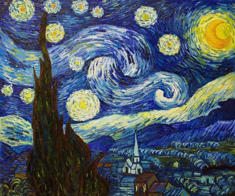
The impasto technique is usually associated with the work of Vincent Van Gogh. It is said that he applied the paints directly onto the canvas and simply mixed them together with his own fingers. One of the examples of the impasto technique in his oeuvre is the painting The Starry Night. Here, in order to make the stars in the night sky appear as bright as possible, he strove to apply paint with an extremely thick consistency, using bold brush-strokes, thereby highlighting the lights.

Vincent van Gogh "The Starry Night"
Vincent van Gogh “The Starry Night”

In order for the brush-strokes to appear even thicker and more expressive, artists did not shy away from using thickening agents on occasion. This would lend the painting an incredible texture. One of the substances widely used for this purpose, for instance, was wax. With each brush-stroke, the touches of the palette knife or spatula were imprinted on the painting. Works featuring this technique were produced by artists from a wide range of movements and eras: the Renaissance, the Baroque period, Impressionism, Expressionism, Post-Impressionism. Interestingly, the Impressionists applied paste from tubes directly onto the canvas, creating the outlines required with a brush once the paint was in situ. In the era of Impressionism and Expressionism, this technique made it possible to obtain a wonderful mirror-image of a crumpled or broken surface, to pick out areas of light amid the darkness, and to emphasize a space. It was the perfect way to convey feelings, concerns and emotions for the paintings of the Expressionists, for them to express their egos on canvas, and to show what is accessible only to those who see, not to those who merely look.

There are a whole range of methods and rules for applying paints to bases:

  • With the help of a brush, a palette knife, a tube or using additional additives;
  • The thick layer should be allowed to dry in conditions whereby the process can take place as slowly as possible. This approach protects the layer of pigment from cracking up and prevents wrinkles from appearing;
  • If the ingredients are too fatty, this will definitely make it more difficult to create textures and expressive brush-strokes;
  • Flat brushes or small brushes made of artificial horsehair will be ideal for this technique;
  • If you add sawdust, sand or very fine grit to the pigment, this will lend a unique aspect to the texture and allow you to really liven up your work, and above all – to increase the volume of each brush-stroke;

Some artists cover their completed paintings with a special glaze. Its thin film provides excellent protection that will prevent cracks and wrinkles appearing in the pigment and prevent it from peeling.

source: SUNY Purchase, Pearl Paint, Old Holland 1664, Van Gogh Albany, NY Exhibit: The Immersive Experience #vangoghimmersivexperience #vangoghimmersion #vangoghimmersive #vangoghimmersiveexhibit #vangogh #vincentvangogh #art #impasto

Celtic Art Book of Kells

Here’s a short intro to celtic art through The Book of Kells at Trinity College conservation research

Susie Bioletti, Head of Conservation at Trinity

Celtic Clip Art

Check out my digital download section for celtic vector design for download

Nancy Tranter Visual Artist ancient celtic circle lakenheath vector art digital downloads nancytranter.com

Vector Design Ancient Celtic Circle Motif by Nancy Tranter


Vector Design file Ancient Celtic Circle Motif (Digital File) Contains everything you need to start creating beautiful Kells illumination designs. Perfect for logos, posters, print advertisements and on the web. 

The Borders and frames have a unique design, and can easily be adapted to fit any circular shape. All designs are 100% vector and have editable strokes which allow you to change the weight/thickness of the lines. 

FEATURES: contains 13 file format designs 
AI
PDF
EPS
JPEG
PNG transparent
SVG black & transparent
DXF
WMF

– High Resolution 800 dpi scalable vector format 
– 350 DPI for photographs
– AI format Adobe Illustrator required for editing or compatible software that would accept an AI file

copywrite law: You are not allowed to claim this file as your own or resell the files. Partly based on: Irelands ancient providence themes, and educational techniques in {Celtic Design Book by Aiden Meehan ISBN 978-500-28674-6}, celtic art teachers at St. Philip Neri NY. USA

Can be used for Commercial reasons .The licensed asset can appear in up to 5,000 end products for sale :

-Up to 5,000 physical or digital end products for sale
-One business social media account owned and managed by the licensee
-Unlimited physical advertisements for local markets
-Digital paid advertisements with unlimited impressions
-Broadcast and streaming for up to 500,000 lifetime viewers
Cannot be used for:
-Native apps, web apps, or games

Shout Out to Studio Hemoy

Graphic Designer for Studio Hemoy

for a full list of production work and graphic design check out nancytranter.com or my linkedin profile for work history

Studio Hemoy is an up and coming interior design group that has experience in property management and Interior Design. It’s always wonderful to be a graphic designer for a French team of interior designers. Check out their latest podcast “Les couleurs ont une influence sur notre humeur, notre performance, notre productivité, notre bien-être, notre qualité de travail Notre environnement immédiat influence l’esprit des gens. Que ce soit par l’aspect visible (rangé ou désorganisé), ou par l’aspect plus invisible à première vue comme les couleurs”

rose quartz bracelet gold by nancy tranter
the advertisement that i’m in for instagram
Check Out Our Great Selection Of Single User Art Supplies! Get Free Shipping On Orders $99 Or More At Discount School Supply! Shop Now!

Source: nancytranter.com @nancytranter @studio.hemoy

#graphicdesign #pantonecoloroftheyear #pantone2022 #colortheory #decorationmaison #decorationinterieure #madecoamoi #bienetreauquotidien #accompagnement #decorationmaison #laminutedeco #sesentirmieux #oser #homeofficeinspiration #freelancelifestyle #studiohemoy #couleurdelannée #veryperi #casavogue @emilydobbsinteriors @home.society @nancytranter @thenordroom @unapizcadehogar @westwingfr @westwing_es #luxesource

Pantone Color of the Year 2022, 17-3938 Very Peri, Graphic Designers Resource

Color Trends in Design 2022

One of the color trends that we will begin to see in graphic design will be the use of something called Pantone colors. Marketing Color Consortiums drive large sections of commerce. How important is this to your art? It all depends. I tell my students that creating an original style (their unique signature) is the way to go. This includes the color palette that you have defined for yourself. You always have the choice to not use Pantone Trends and that in the end may be a better design choice. Knowing about Pantone colors is important you need to understand the industry you are designing for and not knowing about their existence is like not doing your art history homework.

Pantone Very Peri interior design living room a striking shade of periwinkle, Color of the Year 2022
Pantone Very Peri interior design living room a striking shade of periwinkle

After a year so full of ups and downs, users will want navigation experiences that are soothing colors. Therefore, the use of subtle blues, violet blues and reds will be of great importance for graphic design and will generate a great impact on users.

Detailed Color Analysis Series Very Peri

Color trends in graphic design 2022 Flat colors

2021 has shown us that we spend more and more time on our cell phones, computers, and tablets. The use of flat colors will guarantee the comfort of our eyes. Simple, subtle, fresh and natural designs that facilitate online navigation for a long time.

Motion Graphics

Whether you’re walking past a digital billboard, scrolling through a website, or navigating an app, we see more and more motion design at the moment. And most people in the profession believe this can only be a good thing. Static graphics have a way of being overlooked. The constant drive of digital platforms for something fresh and the rise of virtual reality have brands finding new ways of living online. The new possibilities and opportunities using motion and animation are becoming a better way to tell a story to sell a brand.

#graphicdesign #design #pantone2022 #veryperi  #pantonecoloroftheyear

Henri Matisse Cut Outs and How He Carved into Color

The resilience of Henri Matisse cut outs as he deals with chronic pain in his later years

Henri Matisse cut outs came about because chronic illness had made painting more difficult. The painter made his name by putting brush to canvas and when he no longer had eye muscle and proper hand-coordination, he made his mark all over again by putting scissors to paper. A flickery home movie of an elderly Henri Matisse shows the artist in a hurry with his giant scissors, cutting asymmetrical, floppy leaf forms out of paper. He compared cutting to the feeling of flying. He enjoyed being able to move them around to contemplate their respective positions within his composition.

Henri Matisse in studio working with cutouts
Henri Matisse in his studio with assistants who would cut rectangular sheets of paper from large rolls

Henri Matisse cut outs technique may have originated from his influence growing up in a textile region in France. The paper cut-outs have a dressmaker’s pattern influence. The studio that he worked in had many textiles for inspiration surrounding him. There was an exhibit that became the source for my idea for this relationship called Matisse: The Fabric of Dreams: His Art and His Textiles JUNE 23–SEPTEMBER 25, 2005 at the Met. It features forty-five painted works and thirty-one drawings and prints displayed alongside examples from Matisse’s personal collection of fabrics, costumes, and carpets. That exhibition marked the first public showing of Matisse’s textile collection—referred to by the artist as his “working library”—which has been packed away in family trunks since Matisse’s death in 1954. According to his grandson Paul, he enjoyed using the cutout technique right up unto the end of his life.

“An artist should never be a prisoner of himself, prisoner of style, prisoner of reputation, prisoner of success”

Henri Matisse
Stock Your Classroom With Colorations Bulk School Supplies From Discount School Supply & Get Free Shipping On Orders $99 Or More Discount School Supply! Shop Now! At Discount School Supply! Shop Now!
Henri Matissein bed at studio composing cutout pieces with long stick

It was noted by friends, family, and colleagues that Matisse had an intensity about him and that he loved to work. He could not stop creating no matter what his physical condition. A type of wilfulness that is indispensable when producing commissioned artwork while in chronic pain.

Henri Matisse and cat
Henri Matisse The Parakeet and the Mermaid, c. 1952
The Parakeet and the Mermaid, c. 1952

Henri Matisse Cut Outs Paint Process

The color on his cut-outs was produced using gouache—a water-based, opaque, quick-drying, matte paint that consists of pigment, binder, and often a white pigment or filler to increase opacity. Matisse purchased a wide range of colors at supply houses in Paris and Nice, choosing tubes based on color and freshness. Studio assistants cut rectangular sheets of paper from large rolls. Gouache, thinned with water, was applied to paper and then weighted until dry. Some sheets had a more dense application of gouache and some more visibly retained the brushstrokes.

Matisse’s Cut Out
Check Out Our Great Selection Of Single User Art Supplies! Get Free Shipping On Orders $99 Or More At Discount School Supply! Shop Now!

Source: MOMA, CBS this morning Meggie Miao, Mike Levine, SUNY Purchase

Color Inspiration From the Flower Bee Balm for Graphic Design, Firelight 17-1460 Pantone

Color inspiration of the day is Bee Balm (Monarda) from hair dye to a graphic designers color breakdown.

In the area of the web, a general rule is that all colors should be in RGB format. On the other hand, print media is rooted in CMYK or Pantone spot colors. The truth is that, despite the gap, one can get pretty close to matching colors in web and print. Alas, it is never a perfect process as colors do not end up looking identical. This is one of the main obstacles that designers face.

The hair color inspiration of Bee Balm is the percentage of the following. Hair recipe is based on starting with a hair color of classic brown #4 bleached to blonde #6 with heavy orange overtones. 

source: perbang.dk, adore hair color, pantone #danielricciardo #firelight 

Vector Mandala Digital Art Designs

Vector Mandala Digital Art file Motif (Digital File) http://ow.ly/nxgW50ExgKb Contains everything you need to start creating beautiful mandala art serpentine designs

Vector Mandala Digital Art Design is available for purchase at nancystoreonline.comThe Mandala evokes the collective archetype of the circle, with no beginning, no end. It is inclusive, as Egypt’s richly polytheistic culture tended to accommodate, rather than to exclude. The mandala is found universally; All cultures use the circle in their art and religious symbolism. The circle is inherent in the human unconscious.

A colorful tibetan mandala in a monastery
a colorful tibetan mandala in a monastery

INCLUDED WITH THE PURCHASE OF THIS LISTING OF Vector Mandala Digital Art:

Perfect for logos, posters, print advertisements and on the web. Complex complementary color palette.The Borders and frames have a unique design, and can easily be adapted to fit any rectangular or square shape. Some designs are 100% vector and have editable strokes which allow you to change the weight/thickness of the lines.


FEATURES: contains 8 file format mandala design 
AI, PDF, EPS, JPEG, PNG, SVG, DXF, WMF
– High Resolution 800 dpi scalable vector format- 300 DPI for photographs- AI format Adobe Illustrator required for editing or compatible software that would accept an AI file
copywrite law: You are not allowed to claim this file as your own or resell the files.
Can be used for Commercial reasons. The licensed asset can appear in up to 5,000 end products for sale :
-Up to 5,000 physical or artistic design digital end products for sale-One business social media account owned and managed by the licensee-Unlimited physical advertisements for local markets-Digital paid advertisements with unlimited impressions-Broadcast and streaming for up to 500,000 lifetime viewersCannot be used for:-Native apps, web apps, or games
For more mandala art designs to purchase check out my nancystoreonline.com

click here to check out my fiber arts

source: my friends wedding, Jung, Ogden Goelet vectordesigns #middleeastern #egyptian #vector #motif #mandala #red #purple #weddinginvite #digitalfile #serpentine #egyptianmandala #blogging

Decorating for Easter Try Pysanky an Overview on How to Make Ukrainian Easter Eggs

Pysanky, these Ukrainian Easter eggs are decorated using the wax-resist (batik) method. Covered in stunning motifs often taken from Slavic folk art 

Pysanky (plural form of pysanka) is from the Ukrainian word “pysaty” meaning “to write.” Pysanky eggs are hand-drawn creations—first in pencil using guidelines to section off eggshells into a grid pattern, and then with detail within the grid. Afterward, pencil lines are covered with beeswax using a stylus or writing pen called a kistka and dipping in dyes of progressively darker shades. Similar to the batik work done on fabric. The last step is to remove the wax with a candle flame to reveal the beautiful design hidden beneath.

Egg Painter circa 1930 Ukrainian Ethnological Center of the Maksym Rylsky Institute of Art
visual artist nancy tranter
Pysanky for sale Proceeds go to chooselove.org

But the intricacy of the design is not the only thing that makes a pysanka beautiful. Even simple patterns can be just as striking as detailed ones. The key to beautiful traditional decorating for easter pysanka is symmetry and precision (although symmetry does not always play a role in contemporary patterns). By precision, I mean that the design is drawn within a grid that has been laid out meticulously, I use a lathe and see-through the ruler/stencil for drawing circles. If a pysanky is only divided in half, each half will measure exactly. Similarly, in quadrants, each will measure the same. The entire design, whether simple or detailed, depends on these first measurements to be exact. This is especially important if the egg will be very intricate.

If you have decorated an egg, then you have participated in one of the oldest decorative arts. Archaeologists have long known of egg art if the form of decorated ostrich shell pieces and empty eggs in Africa of great antiquity, found in tombs or archaeological digs, but they did not know how old this custom was. In 2010 an important find was announced that a team led by Pierre-Jean Texier found a cache of decorated ostrich eggs in layers in South Africa dating from 65,000 to 55,000 years before the present. They had been whole shells but crushed into fragments over time. These eggs were likely used for storing water, as hunter-gatherers of the Kalahari desert do even today. It is speculated that the designs might have been the mark of individual owners of the shells.  An interesting find was that the scratched decorations on the eggs changed over time. Earlier eggs had cross-hatched designs that looked like railroad tracks. Later designs used finer parallel scratches inside of lines. Archaeologists have unearthed ceramic decorated eggs in Ukraine dating circa 3,000 B.C. For those ancients worshiping the sun god Dazhboh, decorated eggs were an affirmation of spring following a harsh winter. The eggs were also considered protection against illness and other forms of misfortune.

When Ukrainians adopted Christianity in circa 988, the practice of easter egg decorations continued but with the focus on Easter. Every egg coloring design has meaning. In the first century A.D. Christians took the ancient legend of the phoenix (one symbol of the sun to the Egyptians) as a sign of the resurrection[i]; in illustrations the bird stands on the egg from which it has risen. Hence, the Easter egg. The first color used to dye Easter eggs was red, symbolizing blood and its life-giving qualities. For several centuries early Christians observed all the traditional Jewish festivals, and thus Easter and Passover coincided. Colored eggs are also used in some Passover celebrations, but whether it was a tradition borrowed from Christianity or not remains a mystery. In ancient China eggs, dyed scarlet, were given as gifts in the spring. A circle represents the sun and integrity, also nature’s triumph over evil. Dots stand for the future. A star or “rosetta” is used to convey life itself, the source of light, beauty and perfection. Triangles are air, fire and water. Straight lines indicate eternal life.

$5.00 coupon on your order price per egg $3.81 USD

There is meaning to the colors, too. White represents purity, birth, light and rejoicing. Green is fertility and hopefulness, the sun and life’s joys. Purple means faith, trust and patience. Black symbolizes constancy, eternity and the dark before dawn. Throughout history, eggs have been at various times magical, protective, divine — even evil, and they are an obvious fertility symbol. In Buddhist, Taoist and certain Russian rituals they are offered to the dead as representations of the revitalizing powers of nature. 

I think the best learning egg dyeing videos are from Lorie Powpow master pasanky artist. Some tips of mine for in addition to Lorie are: 1) Double down on yellow aniline dye, 2) use a 1 tsp citric acid and 4oz of distilled water and submerge egg for 15min to remove egg membrane and make a perfect canvas, 3) use magic eraser Mr Clean sponge and a drop of water to remove pencil lines never use a rubber eraser. 4) if you love it invest in an electric kistka (wax pen). 

How to draw pysanky designs. Here below is a step by step illustration for a few easter egg designs for pdf download. 

pysanky pysanka wax-resist (batik) Here below is a step by step illustration for a few easter egg designs for pdf download. 

For more detail on pysanky using natural dyes and other egg decorating techniques and folklore see the pamphlet “Egg Art,” Library of Congress American Folklife Center (1982).

Pysanky sculpture was commissioned by the town of Vegreville, in the Canadian province of Alberta noted for its high Ukrainian Canadian population
The sculpture was commissioned by the town of Vegreville, in the Canadian province of Alberta noted for its high Ukrainian Canadian population. In order to obtain funding for it, the town applied for a federal government grant and was eventually able to obtain some funding, but only if the sculpture was dedicated to the 1975 centennial of the Royal Canadian Mounted Police. Vegreville received a grant to construct the egg, a nod at Ukrainian culture in Canada,and specifically at early Ukrainian settlements east of Edmonton, Alberta
These are the Best for Outdoor Activities They set up Quick and are a great shelter for Pysanky Workshops

The current Pysanka Museum building was built in 2000 in the western Ukrainian city of KolomyiaIvano-Frankivska Oblast. Previously the pysanka collection had been housed in the Kolomyia church of the Annunciation. The museum is part of the National Museum of Hutsulshchyna and Pokuttya Folk Art. The central part of the museum is in the shape of a pysanka (Ukrainian Easter egg). This is the only museum in the world dedicated to the pysanka, and it has become a calling card of the city. In August 2007 the museum was recognized as a landmark of modern Ukraine.

Pysanky Pysanka Museum building was built in 2000 in the western Ukrainian city of Kolomyia, Ivano-Frankivska Oblast.

The video below is how I set up batik dyeing.

Egg Art by Visual Artist Nancy Tranter

Pysanky easter egg art Four Seasons by visual artist Nancy Tranter
visual artist nancy tranter pysanky
Pysanky Egg Art by Visual Artist Nancy Tranter
pasanka wax resist batik multiple eggs
Pysanky Egg Art by Visual Artist Nancy Tranter
pasanka wax resist batik wolf
Pysanky Egg Art by Visual Artist Nancy Tranter
pasanka wax resist batik multiple designs
visual artist nancy tranter

source: Ukrainian Ethnological Center of the Maksym Rylsky Institute of Art. Book: Makovsky S. Folk art of Subcarpathian Russia, So Jeo, Laurie PopowLuba Perchyshyn, Gail Lamba, Texier, Pierre-Jean, Library of Congress cataloging Slavic materials, St. Clement of Rome, First Epistle to the Corinthians, Euromaidan Press, Slavko Nowytski, Authentic Ukraine O. Yasinska & I. Fediv, wikipedia.org, American Folklife Center Librarian J. Gray

#pysankyeggdesigns #pysankysupplies #bestpysanky #pysankydesigns #pysankykit #ukrainianpysanky #howtodrawpysankydesigns

3 Sites to Help You Become an Expert at Computer Repair Turning Geek Into Chic Everyday

Tips About Computer Repair because of a Broke Down Graphics Day

This is a story about computer repair while in the Central Swartekill Wetlands. Once in a while, you find yourself in a remote region with little access to amenities. I was exploring the Swarte Kill in New York. Central Swartekill Wetland (also known as Plutarch Swamp), is one of the more beautiful regions that I don’t think too many people know about. All along Plutarch Rd is a heavily dense wild natural region with an abundance of wildlife, a bird migration route, different types of Red Hawk raptor and, an environmentally protected snapping turtle region, with additional rare species.


plutarch swamp -David Jakim and Lawrence McGlinn, Geography, SUNY-New Paltz,

I was set up in a cabin about to edit the pictures for the day and my cord dies. Then my backup cord dies and I have about 2 hours left before my laptop shuts down. 

Being a hardened graphic designer who was used to the speed of being in a NYC “graphics ring” I quickly McGuivered a power cord.

If you read any basic electronic manual, you’ll notice that an anti-static wrist strap is one of the first things that they recommend. But it’s often the most neglected. If you plan on doing any work with your electronics, you should make sure that you pick one up.

computer repair static wrist guard

I pried open the shell casing with a spudger, then I used a Satco 90-099 Chain Pliers to open it up further.

plastic spudgers for computer repair
computer repair chain pliers for power cord

Then I frankensteined. Swapping all the working parts around, playing with a soldering tool, and triple-checking polarities.

computer repair soldering tool

So glad it works. I wonder if I can stick computer repair under my resume. At the very least I can maintain my equipment in a pinch. The motherboard is certified apple OEM, and the cords are from Hong Kong. 

  1. IFIXIT this is the closest manual instructions for repair that I could find. Ifixit is a place that has repair guides for every thing, written by everyone. This is my favorite site for computer repair.
  2. Lifehacker’s Top 10 Computer Hardware Fixes and Upgrades These fixes or upgrades are easy enough for most of us to do.
  3. Macrumors News, rumors, discussions, a place to ask questions and how to instructions.

Upon completion of my computer repair I returned to my nature project of taking pictures of wildlife and making color studies of Plutarch Swamp

Vernal Pools and What I Learned from Observing Like an Artist.

spotted salamander photo courtesy of Cornell University
Spotted Salamander
Grey Treefrog photo courtesy of Cornell University
Grey Treefrog camouflaged resting against tree trunk

The most important thing about Plutarch Swamp are the Vernal pools. They are a common, but threatened habitat type in the Hudson River Estuary corridor. They are often damaged because they are overlooked or not appreciated by landowners, or in environmental reviews for development. Vernal pools and their surrounding terrestrial areas provide critical habitat for a number of amphibians and invertebrates, some of which breed only in vernal pools. Vernal pools are the only significant breeding areas for Jefferson salamander, spotted salamander, marbled
salamander, and wood frog. Other typical users include spring peeper, spadefoot toad,
gray treefrog, American toad, and other amphibians that depend on pond habitats for
reproduction.

Spring peeper -photo provided by cornell university
Spring Peeper Frog

source: Jakim and McGlinn Geography SUNY-New Paltz, IFIXIT, eekwi.org, New York Cooperative Fish & Wildlife Research Unit, Department of Natural Resources, Cornell University, some photo credits by Adirondack Council and Cornell university