
The Baker Miller Pink Study Appetite Suppressant In 1979, Dr. Alexander G. Schauss, experimented with the use of a particular shade of pink and its effect on mood and behavior. The color is frequently called baker miller pink paint. It was found that this pink color was associated with a short-term decrease in aggression.
Baker-Miller. They “observed relaxation of the subjects when they stared at an 18 by 24-inch cardboard plate” of this color of pink. They found that no other color consistently resulted in the same relaxation. Dr. Schauss then did some experiments on himself. He observed that his blood pressure, pulse, and heart rate were unaffected by exposure to this shade of pink. However, “after intentionally increasing cardiovascular activity through a series of intense physical exercises, [he] found that this color had a marked effect on lowering [his] heart rate, pulse, and respiration as compared to other colors.”
Stress Relief If you are stressed, you may want to look at a page of Baker-Miller Pink to see if it relaxes you. If it does you can print the page and carry it with you to look at any time you need some stress reduction. The exact color of Baker-Miller Pink was experimented with by Strauss. Hundreds of shades of pink were sorted through. He finally zeroed in on the color that he named Baker-Miller pink as the one which gave the most consistent results in “reducing hyperexcitability.” Could Baker-Miller Pink Also Reduce Aggression? He then wondered that, since the color pink could reduce his heart rate, blood pressure, and pulse (when they were intentionally elevated), could it affect aggressive behavior?
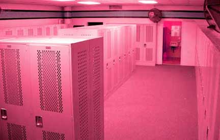
He attempted to convince officials at the Washington State Department of Corrections to try painting the receiving rooms at a correctional facility the color pink to determine if it had any effect on aggressive behavior. Not surprisingly, officials balked at his color suggestion. However, two brave soles were willing to give it a try. In 1979, Commander Miller and Warden Gene Baker at the U.S. Naval Correctional Center in Seattle painted the walls and ceiling of one admissions cell the color pink that Dr. Schauss would later name after them. After 156 days, they reported to the U.S. Navy’s Bureau of Naval Personnel, Law Enforcement and Corrections Division, Washington, D.C. that “Since the initiation of this procedure on March 1, 1979, there have been no incidents of erratic or hostile behavior during the initial phase of confinement.” They found that an exposure of 15 minutes or less was all that was needed to reduce aggression in the detainees. They also discovered that the effect lasted at least another 30 minutes after leaving the Pink Room, which made it easier for the officials to complete their paperwork and assign the detainee to a permanent cell without having to deal with aggressive behavior. Reduction in Strength Dr. Schauss also discovered that the calming effect reduced the strength of the subjects. Experiments were conducted which demonstrated that people were able to lift less weight after gazing at Baker-Miller Pink than they could before they looked at it. In the 1980’s the television show ‘That’s Incredible’ had men gaze at a blue poster, then a pink one. After gazing at the pink one, they were able to hold less weight in their outstretched arms. This reported loss of strength has been used in interesting ways.
As reported in “The Hawk Eye,” May 26, 1998, when Hayden Fry, was the coach of the University of Iowa’s football team, he had the visiting team’s locker room painted pink in an attempt to make the other team weak and less aggressive. The Western Athletic Association put a stop to that by making a rule that the home team and visiting locker rooms could not be painted different colors. Baker-Miller Pink – a Natural Appetite Suppressant The U.S. Naval Office of Research in Washington, D.C. conducted further research over the next four years at the Health, Weight, and Stress Clinic at John Hopkins University Hospital in Baltimore, Maryland. These experiments were overseen by Maria Simonsen, M.D., the Clinic’s Director. Experiments on stress reduction by the use of Baker-Miller Pink were conducted on 1,700 subjects. They found another interesting effect. The subjects who were there for stress reduction reported Baker-Miller Pink to be an appetite suppressant. Experiments on other subjects who were there not seeking stress reduction but rather a method of weight control confirmed the same results in one-third of the subjects.

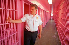
Dr. Schauss then conducted further research in 1979 at the Santa Clara, California, County Jail. The first day the staff left inmates in painted pink cells with Baker-Miller Pink for several hours. The inmates scratched the paint off the walls with their fingernails! “Otherwise, no aggressive or aberrant behavior was observed.” After that, they limited the time to 15 minutes. The experiments gathered more information. First, they learned that the color was far more effective in an 8′ X 10′ cell than in the larger holding cell. Second, they learned that the color was more effective with only one inmate in the room. Experiments on Psychiatric Patients Later that year, at the Veterans Administration Medical Center, Los Angeles, Adam Coutts, Chief of Management Sciences conducted experiments with psychiatric patients. He painted rooms in the psychiatric ward different colors. One of them was painted Baker-Miller Pink. “After several months of study, he felt enough evidence had been collected to support the U.S. Naval Correctional Center’s findings that he advocated the need for a long term study.” Remarkable Results With Aggressive Youth. New Observations After this, experiments were conducted by Chief Clinical Psychologist, Paul Boccumini, Ph.D., Director of Clinical Services at the San Bernadino, California, County Probation Department. At the Kuiper Youth Center, he assigned staff nurses to observe the subjects. They placed 27 “obstreperous youth” in rooms painted Baker-Miller Pink. The rest were placed in other colored rooms. They made significant new observations during this experiment. After 2-3 minutes in the Pink Room, subjects became less verbally aggressive. This was true “regardless of the degree of aggressive verbal or physical behavior” before being placed in the rooms. After 5-6 minutes, “each youth would desist from using either physical violence (i.e., kicking the door, hitting or pounding of the walls, etc.) or continue self-mutilative behavior.” After 8-9 minutes, “each youth would assume a relaxed sitting position or lay on his or her back, spread out on the floor while frequently looking at the ceiling.” Within 10 minutes, “each youth sufficiently calmed down so that he or she could be returned to the main hall.”
$65.00 nancystoreonline.com