One of the color trends that we will begin to see in graphic design will be the use of something called Pantone colors. Marketing Color Consortiums drive large sections of commerce. How important is this to your art? It all depends. I tell my students that creating an original style (their unique signature) is the way to go. This includes the color palette that you have defined for yourself. You always have the choice to not use Pantone Trends and that in the end may be a better design choice. Knowing about Pantone colors is important you need to understand the industry you are designing for and not knowing about their existence is like not doing your art history homework.
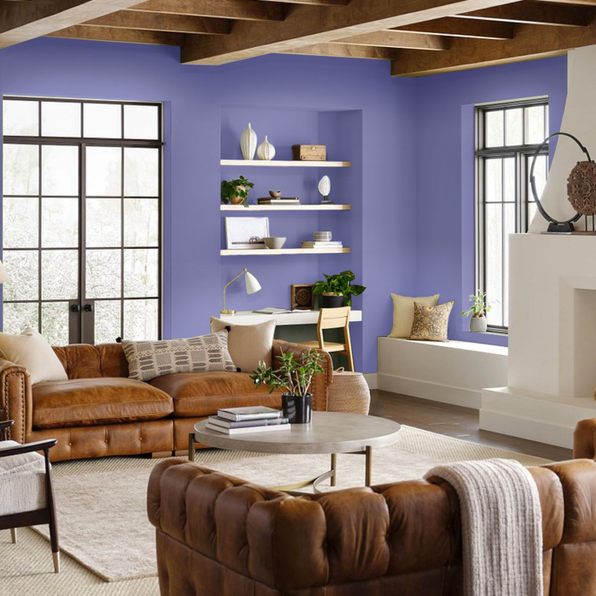
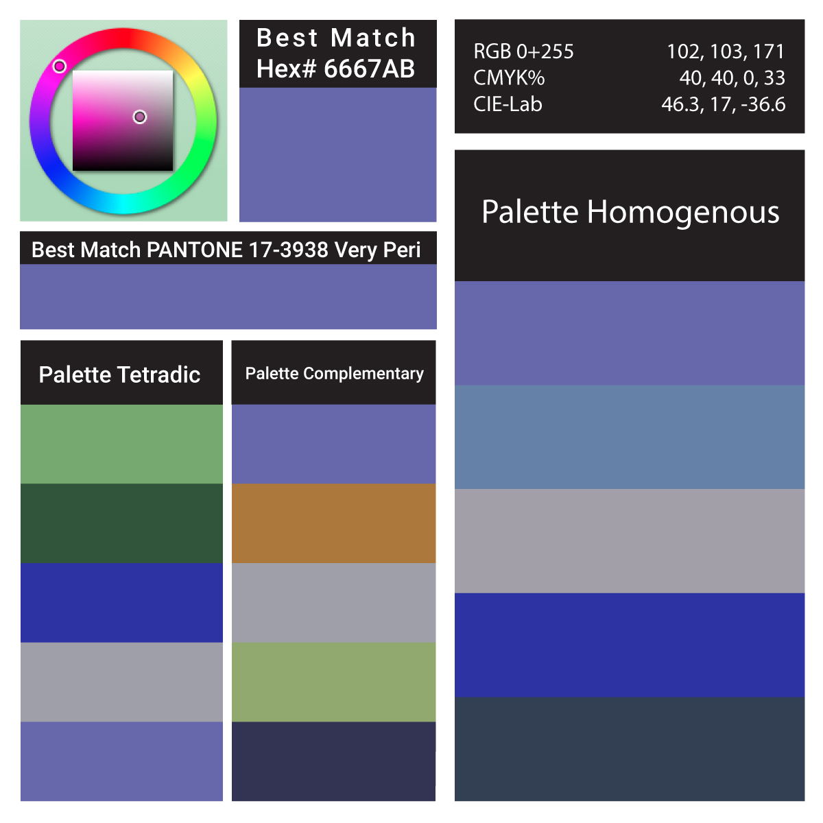
Pantone Very Peri interior design living room a striking shade of periwinkle
After a year so full of ups and downs, users will want navigation experiences that are soothing colors. Therefore, the use of subtle blues, violet blues and reds will be of great importance for graphic design and will generate a great impact on users.
Detailed Color Analysis Series Very Peri
Color trends in graphic design 2022 Flat colors
2021 has shown us that we spend more and more time on our cell phones, computers, and tablets. The use of flat colors will guarantee the comfort of our eyes. Simple, subtle, fresh and natural designs that facilitate online navigation for a long time.
Motion Graphics
Whether you’re walking past a digital billboard, scrolling through a website, or navigating an app, we see more and more motion design at the moment. And most people in the profession believe this can only be a good thing. Static graphics have a way of being overlooked. The constant drive of digital platforms for something fresh and the rise of virtual reality have brands finding new ways of living online. The new possibilities and opportunities using motion and animation are becoming a better way to tell a story to sell a brand.
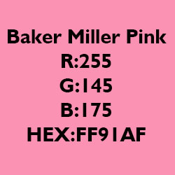
Baker-Miller Pink Hex FF91AF Frequently Called Baker Miller Pink Paint or P-618
The Baker Miller Pink Study Appetite Suppressant In 1979, Dr. Alexander G. Schauss, experimented with the use of a particular shade of pink and its effect on mood and behavior. The color is frequently called baker miller pink paint. It was found that this pink color was associated with a short-term decrease in aggression.
Baker-Miller. They “observed relaxation of the subjects when they stared at an 18 by 24-inch cardboard plate” of this color of pink. They found that no other color consistently resulted in the same relaxation. Dr. Schauss then did some experiments on himself. He observed that his blood pressure, pulse, and heart rate were unaffected by exposure to this shade of pink. However, “after intentionally increasing cardiovascular activity through a series of intense physical exercises, [he] found that this color had a marked effect on lowering [his] heart rate, pulse, and respiration as compared to other colors.”
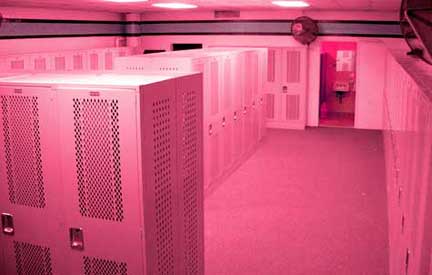
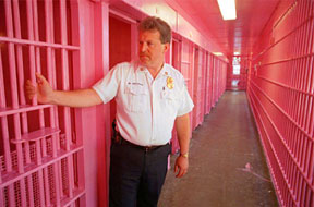
visitors locker room at University of Iowa pink prison Commander Miller and Warden Gene Baker at the U.S. Naval Correctional Center in Seattle painted the prison cells the color pink that Dr. Schauss would later name after them.
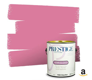
Prestige Paints Interior Paint and Primer In One, 1-Gallon, Semi-Gloss, Comparable Match of Sherwin Williams* Impatient Pink* Prestige Paints has created a comparable color based on color specifications of the original color Baker Miller Pink using industry leading technology.
Stress Relief If you are stressed, you may want to look at a page of Baker-Miller Pink to see if it relaxes you. If it does you can print the page and carry it with you to look at any time you need some stress reduction. The exact color of Baker-Miller Pink was experimented with by Strauss. Hundreds of shades of pink were sorted through. He finally zeroed in on the color that he named Baker-Miller pink as the one which gave the most consistent results in “reducing hyperexcitability.” Could Baker-Miller Pink Also Reduce Aggression? He then wondered that, since the color pink could reduce his heart rate, blood pressure, and pulse (when they were intentionally elevated), could it affect aggressive behavior?
He attempted to convince officials at the Washington State Department of Corrections to try painting the receiving rooms at a correctional facility the color pink to determine if it had any effect on aggressive behavior. Not surprisingly, officials balked at his color suggestion. However, two brave soles were willing to give it a try. In 1979, Commander Miller and Warden Gene Baker at the U.S. Naval Correctional Center in Seattle painted the walls and ceiling of one admissions cell the color pink that Dr. Schauss would later name after them. After 156 days, they reported to the U.S. Navy’s Bureau of Naval Personnel, Law Enforcement and Corrections Division, Washington, D.C. that “Since the initiation of this procedure on March 1, 1979, there have been no incidents of erratic or hostile behavior during the initial phase of confinement.” They found that an exposure of 15 minutes or less was all that was needed to reduce aggression in the detainees. They also discovered that the effect lasted at least another 30 minutes after leaving the Pink Room, which made it easier for the officials to complete their paperwork and assign the detainee to a permanent cell without having to deal with aggressive behavior. Reduction in Strength Dr. Schauss also discovered that the calming effect reduced the strength of the subjects. Experiments were conducted which demonstrated that people were able to lift less weight after gazing at Baker-Miller Pink than they could before they looked at it. In the 1980’s the television show ‘That’s Incredible’ had men gaze at a blue poster, then a pink one. After gazing at the pink one, they were able to hold less weight in their outstretched arms. This reported loss of strength has been used in interesting ways.
As reported in “The Hawk Eye,” May 26, 1998, when Hayden Fry, was the coach of the University of Iowa’s football team, he had the visiting team’s locker room painted pink in an attempt to make the other team weak and less aggressive. The Western Athletic Association put a stop to that by making a rule that the home team and visiting locker rooms could not be painted different colors. Baker-Miller Pink – a Natural Appetite Suppressant The U.S. Naval Office of Research in Washington, D.C. conducted further research over the next four years at the Health, Weight, and Stress Clinic at John Hopkins University Hospital in Baltimore, Maryland. These experiments were overseen by Maria Simonsen, M.D., the Clinic’s Director. Experiments on stress reduction by the use of Baker-Miller Pink were conducted on 1,700 subjects. They found another interesting effect. The subjects who were there for stress reduction reported Baker-Miller Pink to be an appetite suppressant. Experiments on other subjects who were there not seeking stress reduction but rather a method of weight control confirmed the same results in one-third of the subjects.
Dr. Schauss then conducted further research in 1979 at the Santa Clara, California, County Jail. The first day the staff left inmates in painted pink cells with Baker-Miller Pink for several hours. The inmates scratched the paint off the walls with their fingernails! “Otherwise, no aggressive or aberrant behavior was observed.” After that, they limited the time to 15 minutes. The experiments gathered more information. First, they learned that the color was far more effective in an 8′ X 10′ cell than in the larger holding cell. Second, they learned that the color was more effective with only one inmate in the room. Experiments on Psychiatric Patients Later that year, at the Veterans Administration Medical Center, Los Angeles, Adam Coutts, Chief of Management Sciences conducted experiments with psychiatric patients. He painted rooms in the psychiatric ward different colors. One of them was painted Baker-Miller Pink. “After several months of study, he felt enough evidence had been collected to support the U.S. Naval Correctional Center’s findings that he advocated the need for a long term study.” Remarkable Results With Aggressive Youth. New Observations After this, experiments were conducted by Chief Clinical Psychologist, Paul Boccumini, Ph.D., Director of Clinical Services at the San Bernadino, California, County Probation Department. At the Kuiper Youth Center, he assigned staff nurses to observe the subjects. They placed 27 “obstreperous youth” in rooms painted Baker-Miller Pink. The rest were placed in other colored rooms. They made significant new observations during this experiment. After 2-3 minutes in the Pink Room, subjects became less verbally aggressive. This was true “regardless of the degree of aggressive verbal or physical behavior” before being placed in the rooms. After 5-6 minutes, “each youth would desist from using either physical violence (i.e., kicking the door, hitting or pounding of the walls, etc.) or continue self-mutilative behavior.” After 8-9 minutes, “each youth would assume a relaxed sitting position or lay on his or her back, spread out on the floor while frequently looking at the ceiling.” Within 10 minutes, “each youth sufficiently calmed down so that he or she could be returned to the main hall.”
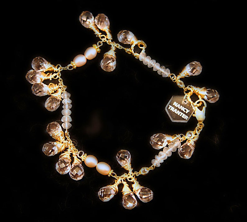
Pink Rose Quartz, Crystal, Pearl and 12K gold Bracelet $65.00 nancystoreonline.com
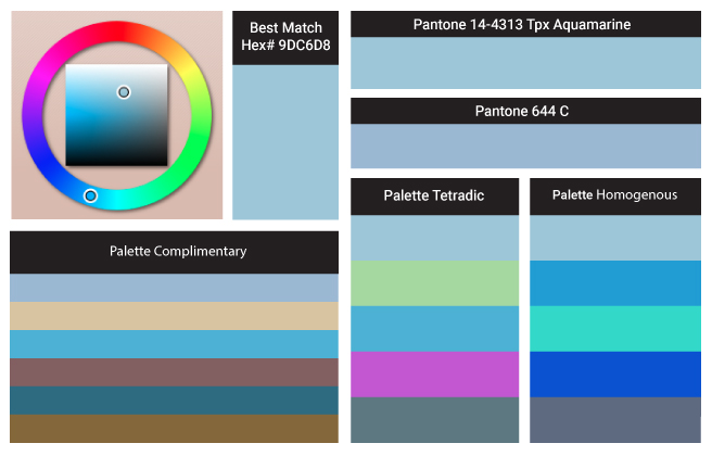
Here we have Aquamarine Color of the Year schemes, paints, palettes, combinations, gradients and color space conversions.
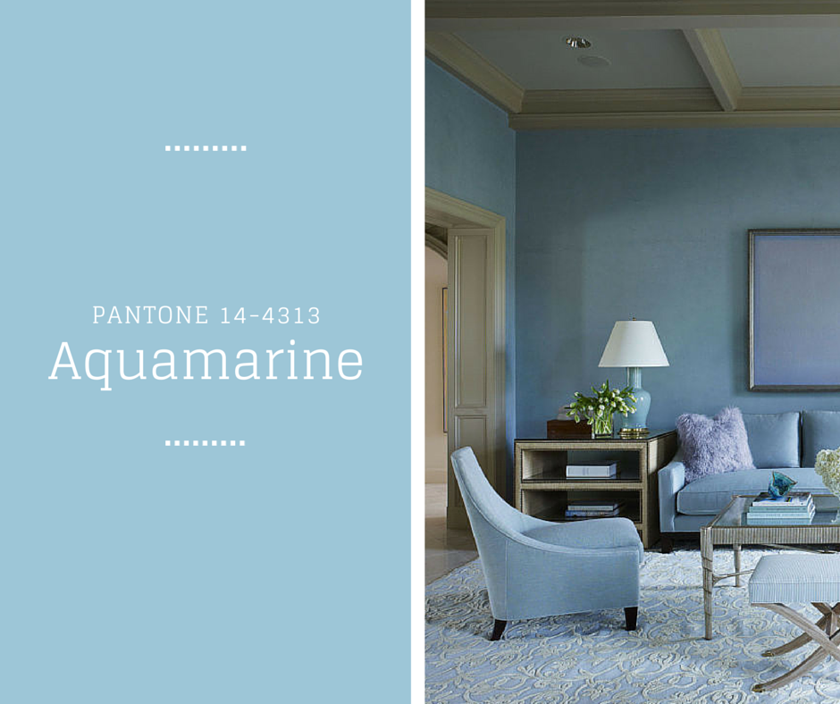
Pantone’s Aquamarine hexadecimal color code is #9dc3d4 this is a medium light shade of cyan. In the RGB color model #9dc3d4 is comprised of 61.57% red, 76.47% green and 83.14% blue. In the HSL color space #9dc3d4 has a hue of 199° (degrees), 39% saturation and 72% lightness. This color has an approximate wavelength of 484.57 nm. The lead color for women for the Spring/Summer 2015 season, PANTONE 14-4313 Aquamarine is an airy blue with a dreamy feel. Cool and calming, ethereal Aquamarine is a shade with a wet and watery feel.
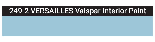
Matching Digital Colors to Actual Paint Colors
Have you ever seen the perfect color on your wanderings? Your next project is how to translate the color you found into interior house paint. I am asked as a designer to select paint colors for my clients based on a digital image emailed to me or found on a website. Factors like scale, lighting, reflection and existing items influence color selection making it a multi-step task. So how do you start? Let me share my findings for Aquamarine. Here is the closest match that I approve of 249-2 VERSAILLES Valspar Interior Paint.
Calm, cool, and delicate, warm tones describe the color trends this spring 2015 season, as mother nature brings so much beauty and a sense of relaxation. A relaxing and airy theme that Aquamarine Blue carries, washes away those winter blues and reinvents a new you; away from cold and into the sunshine.
An invigorating and powerful Scuba Blue that brings along the fun, resembles the clear waters of Greece. This cool shade brings you to paradise or at least makes you feel as though you are there, if you have been dreaming of Spring to finally be here.
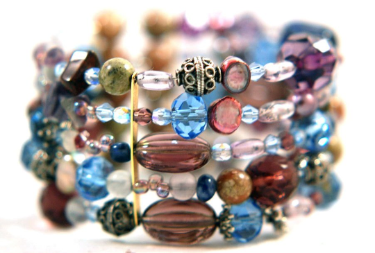
The reflection of the faceted beads is stunning. You will stand out with this bracelet because of its visual impact of colors and materials. These bracelets consist of a memory wire that wraps around your wrist. Different materials for this bracelet include Sterling silver beads and bead caps. Gemstones, Swarovski faceted beads that are fire-polished, freshwater pearls, glass round and faceted beads, acrylic beads. Fits almost any wrist size.
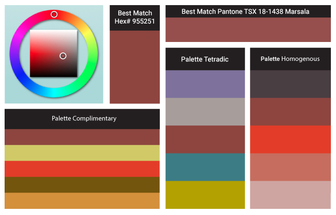
Color of the Year’s Chemistry and What’s Behind Pantone’s Marsala 18-1438
Marsala enriches our mind, body and soul, exuding confidence and stability. Much like the fortified wine that gives Marsala its name, this tasteful hue embodies the satisfying richness of a fulfilling meal, while its grounding red-brown roots emanate a sophisticated, natural earthiness. This hearty, yet stylish tone is universally appealing and translates easily to fashion, beauty, industrial design, home furnishings and interiors.
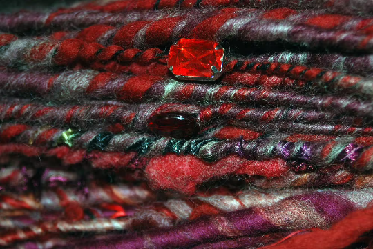
Marsala is a one of a kind art yarn that I spun. The thick and thin art yarns look amazing in finished products! Handspun corespinning is a slow spinning technique which results in the yarn looking very different from a traditional single. The fibers are allowed to wrap around a core thread at a 90 degree angle, it allows the spinner to create a very strong, soft, warm and lofty yarn. however due to the longer time it takes to create a Corespun yarn the cost is higher.
This Yarn is bulky so I like to knit on a size US 10 but you can knit on any size! Thats the beauty of Art Yarn. The cotton, acrylic, wool blend is based on Marsala PANTONE 18-1438. Covered in garnet colored crystal, freshwater pearls, semi precious carnelian, silk ribbons, gold fibers and some gorgeous other found objects. The inspiration came from Byzantium’s vibrant and energetic color palette jewel tones of red and gold with the pop of white pearls. Woven on a very strong nylon cord.
Fall 2013 Color Trends invokes colors that are rustic, warm but bright and dull all in one. It speaks of some of our favorite shades. The fashion color report for Fall 2013 has been unveiled by Pantone LLC. This vivacious palette gives us a direction to the overview of designers’ use of color in their upcoming collections.
Released on the first day of New York Fashion Week, the PANTONE Color Trends Report features the top 10 colors for women’s and men’s fashion for fall 2013, along with designer sketches, quotes, and headshots. The colors come together to create moods that range from sophisticated and structured to lively and vivid. They encapsulate our inherent need for wardrobe variety to reflect emotions that run from thoughtfully introspective to irrepressibly elated.
Multifaceted Emerald continues to sparkle and fascinate, bringing luxury and elegance to the palette, while yellow-toned Linden Green brings a lightness to the deeper shades of fall. Try pairing both with Mykonos Blue, a bold, meditative blue, for a classic and relaxed fall look. Exotic Acai adds mystery to the palette. Pair the elegant shade of purple with Emerald for a regal disposition, or spirited Samba red for an expressive and dramatic look. Koi, a decorative orange with dazzling and shimmering qualities, is a statement color that serves as a pick-me-up for your wardrobe. Vivacious, an unruly and wildly deep fuchsia, adds an ebullient sensuality to the palette.
Press Release PANTONE 17-5641 Emerald PANTONE 18-4434 Mykonos Blue PANTONE 15-0533 Linden Green PANTONE 19-3628 Acai PANTONE 19-1662 Samba PANTONE 17-1452 Koi PANTONE 18-0312 Deep Lichen Green PANTONE 19-2045 Vivacious PANTONE 19-4215 Turbulence PANTONE 19-1116 Carafe
I started using ASE (or Adobe Swatch Exchange) swatches working at a Graphics Print House in Chelsea, New York a few years back. I now use ASE swatch libraries for most of my client’s projects.
So what are ASE Swatch Libraries? ASE’s are customized color palettes in which you choose colors and export them to an original file format called ASE from Illustrator for future use in Illustrator, InDesign or Photoshop. Importing the ASE files works very much like importing any other color swatch such as the preset Pantone® colors. Once imported the swatch will give you a dialog box palette window to hold your colors.
Import a ASE Color Swatch into Illustrator:
In an open or existing document click the drop down arrow on your Swatches Palette.
Select “Open Swatch Library>Other Library.
Select the ASE file you would like to import and click open.
A new palette box will appear with your imported colors.
For my other graphic design resources check out my category archives graphic section