Byzantine Iconoclasm and the Jansen Art text that we have all read gives a though account of the 9th century iconoclasm, but hearing modern examples of this recurring historical problem brings a fresh insight and new thoughts on the topic. Read the stories of Saltz, Griffin & Anderson authors who I have found to successfully represent a modern view of iconoclasm.
“The horrific paradox then is that these killers believe in the power and divinity of images, art, and architecture more than those who make the objects and who see what they make as abstract representations of ideas and things.”
Jerry Saltz
Here is the link to the article that I liked http://ow.ly/HfBOH Iconoclasm Now: CharlieHebdo and the Lethal Power of Art by @jerrysaltz
What is an example of iconoclasm?
Iconoclasm literally means “image breaking” and refers to a recurring historical impulse to break or destroy images for religious or political reasons. For example, in ancient Egypt, the carved visages of some pharaohs were obliterated by their successors; during the French Revolution, images of kings were defaced.

‘Iconoclasm may even aid those who would benefit from cultural amnesia, under the guise of moving on’
Darran Anderson
Here is another great link to an article about Irish Iconoclasm: Body of evidence: a history of Irish iconoclasm 28 JUNE 2019 BY DARRAN ANDERSON

Breaking an image does not eradicate it; it merely replaces it with another. Destruction is part and parcel of creation. Treasures from East Anglian Churches demonstrated just this fact: cruelly mutilated artworks had transformed into powerful warnings against the latent violence of political and religious dogma.
JONATHAN GRIFFIN
Here is another great link to an article about Modern Iconoclasm: The seeds of destruction Art Under Attack: Histories of British Iconoclasm at Tate Britain by JONATHAN GRIFFIN
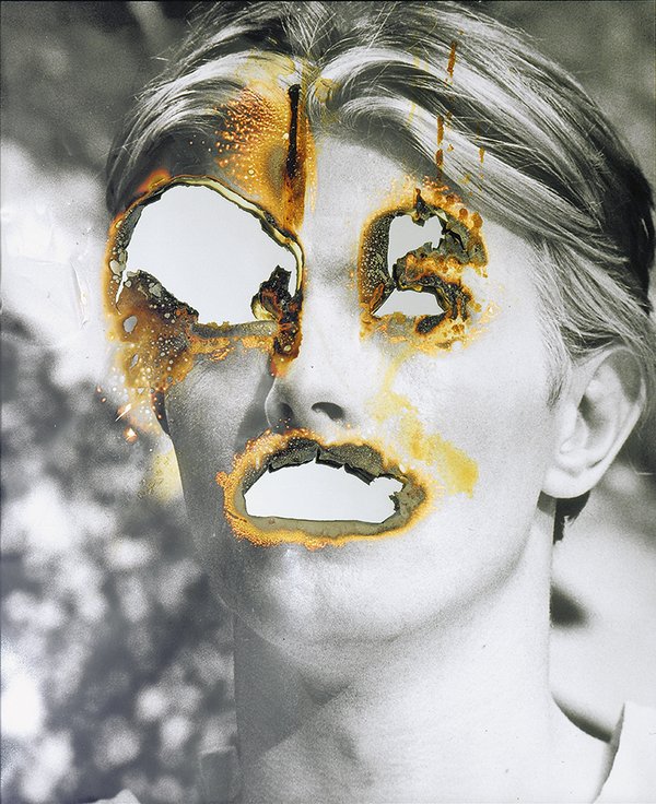
Self Portrait of You + Me (David Bowie) 2007
Burnt photograph, mirror 632 x 530 mm
© Douglas Gordon, courtesy Gagosian Gallery