What does Star Wars and Helvetica have in common? More than you might realize.
The original designer of the Star Wars logo Suzy Rice, based her work on a modified version of Helvetica Black.

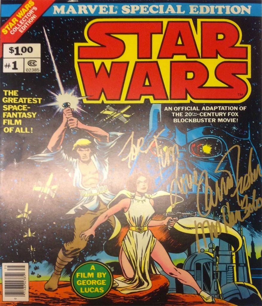
In the words of professional visual artist Suzy Rice- “The cover of that book pictured here to the left bears a reprint of the logo that I designed and drew, after it was redrawn by Lucasfilm, Ltd. (I believe that was done by Joe Johnson) with the flat-bottom “W” and the outline emboldened — both done by Lucasfilm, so it was explained to me by Producer Gary Kurtz, to improve readability of the logo in the main titles of the film (and all the rest that followed).
My logo was redrawn with some modifications but it was never replaced with a new design; or, more specifically, no “new design” was done by Johnson, he simply modified my design for predominantly production quality requirements when applied to the big screen.
Gary Kurtz called me at my work after they’d accepted my logo design for advertising purposes and informed me that he and George were going to use (my) logo, rather than the one they’d been up-to-that-point trying to use in the ongoing production of the film prior to release. My logo read better (was easier perceived by the viewer during the animated title treatment) than the one they’d originally intended to use but my logo required a bolder outline and a flattened W to improve on screen legibility during that quick pan (animated treatment) in the main titles. My response was great!”
Graphic Design Girl Power
Finding out one of my childhood beloved movies also had a lead female graphic designer was a source of inspiration for me as I was learning design.
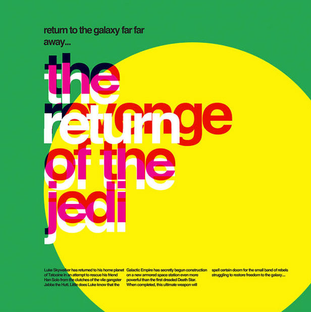
These typographic Star Wars posters reimagine a galaxy far, far away in the style of Massimo Vignelli.
As these vivid typographic posters by Argentinian designer Fernando de Carabassa display, Helvetica and Star Wars might be a match made in heaven. It’s hard to put in words why this works. Thanks to that iconic title crawl, Star Wars is now famously recognized as using large blocks of clean text. It feels like a logical continuation to use colorful blocks of Helvetica to expand those title crawls into Word Art. De Carabassa’s designs use laid-out blocks of text and solid colors to evoke the imagery of the first three Star Wars movies: everything from the sight of two suns rising over the planet of Tatooine, to the crackle of a lightsaber igniting, to the barren, ice-cold world of Hoth. Star Wars, Helvetica, and typography might not be exactly related ideas in most people’s minds, but perhaps they should be.
Fonts similar to Helvetica: Free Alternatives & Similar Fonts
- Inter
- Roboto
- Arimo
- Nimbus Sans
- TeX Gyre Heros
- Work Sans
- IBM Plex Sans
source: Massimo Vignelli, suzyrice.com, fastcompany.com, learnui.design