The resilience of Henri Matisse cut outs as he deals with chronic pain in his later years
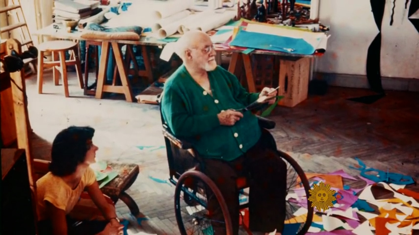
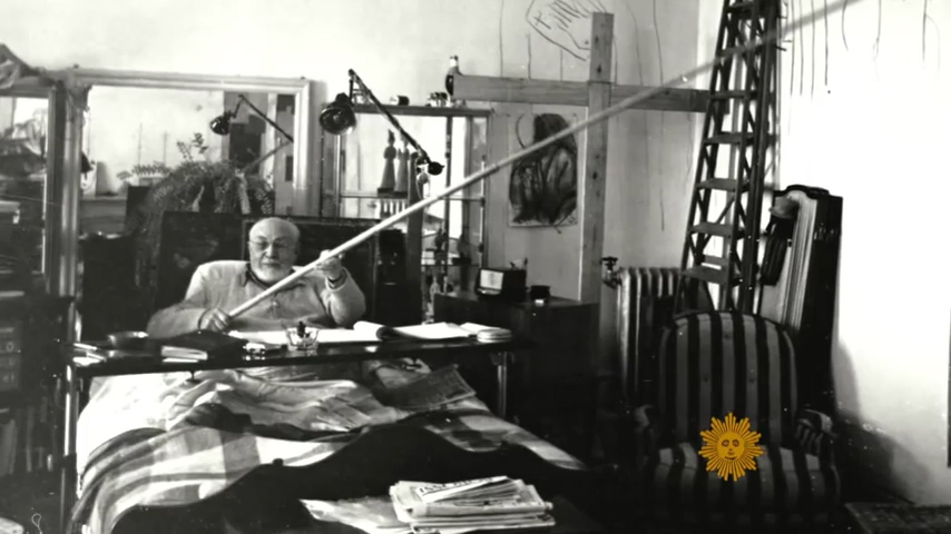
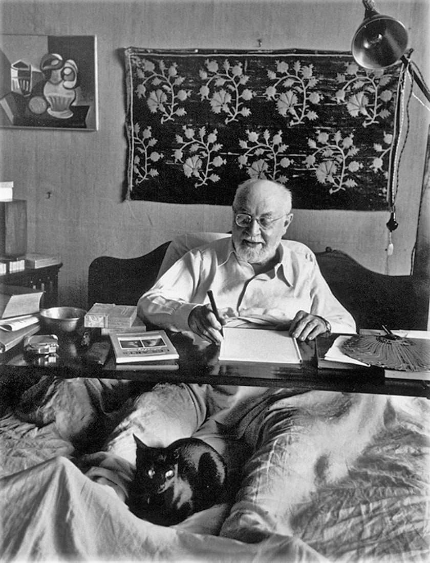
Henri Matisse cut outs came about because chronic illness had made painting more difficult. The painter made his name by putting brush to canvas and when he no longer had eye muscle and proper hand-coordination, he made his mark all over again by putting scissors to paper. A flickery home movie of an elderly Henri Matisse shows the artist in a hurry with his giant scissors, cutting asymmetrical, floppy leaf forms out of paper. He compared cutting to the feeling of flying. He enjoyed being able to move them around to contemplate their respective positions within his composition.
Henri Matisse in his studio with assistants who would cut rectangular sheets of paper from large rolls
Henri Matisse cut outs technique may have originated from his influence growing up in a textile region in France. The paper cut-outs have a dressmaker’s pattern influence. The studio that he worked in had many textiles for inspiration surrounding him. There was an exhibit that became the source for my idea for this relationship called Matisse: The Fabric of Dreams: His Art and His Textiles JUNE 23–SEPTEMBER 25, 2005 at the Met. It features forty-five painted works and thirty-one drawings and prints displayed alongside examples from Matisse’s personal collection of fabrics, costumes, and carpets. That exhibition marked the first public showing of Matisse’s textile collection—referred to by the artist as his “working library”—which has been packed away in family trunks since Matisse’s death in 1954. According to his grandson Paul, he enjoyed using the cutout technique right up unto the end of his life.
“An artist should never be a prisoner of himself, prisoner of style, prisoner of reputation, prisoner of success”
Henri Matisse
It was noted by friends, family, and colleagues that Matisse had an intensity about him and that he loved to work. He could not stop creating no matter what his physical condition. A type of wilfulness that is indispensable when producing commissioned artwork while in chronic pain.
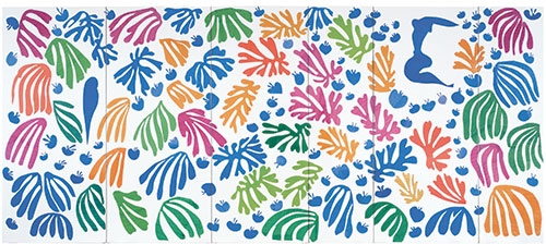
The Parakeet and the Mermaid, c. 1952
Henri Matisse Cut Outs Paint Process
The color on his cut-outs was produced using gouache—a water-based, opaque, quick-drying, matte paint that consists of pigment, binder, and often a white pigment or filler to increase opacity. Matisse purchased a wide range of colors at supply houses in Paris and Nice, choosing tubes based on color and freshness. Studio assistants cut rectangular sheets of paper from large rolls. Gouache, thinned with water, was applied to paper and then weighted until dry. Some sheets had a more dense application of gouache and some more visibly retained the brushstrokes.
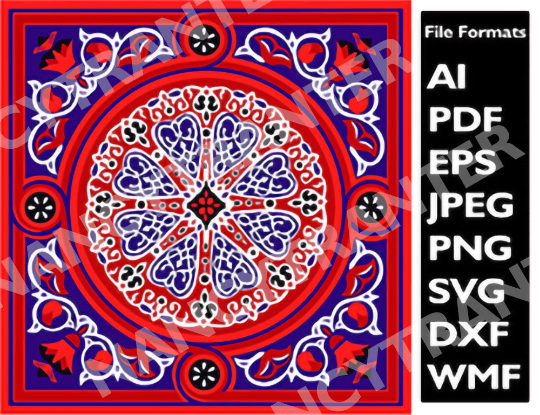
Vector Mandala Digital Art file Motif (Digital File) http://ow.ly/nxgW50ExgKb Contains everything you need to start creating beautiful mandala art serpentine designs
Vector Mandala Digital Art Design is available for purchase at nancystoreonline.comThe Mandala evokes the collective archetype of the circle, with no beginning, no end. It is inclusive, as Egypt’s richly polytheistic culture tended to accommodate, rather than to exclude. The mandala is found universally; All cultures use the circle in their art and religious symbolism. The circle is inherent in the human unconscious.
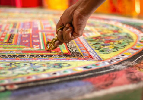
a colorful tibetan mandala in a monastery
INCLUDED WITH THE PURCHASE OF THIS LISTING OF Vector Mandala Digital Art:
Perfect for logos, posters, print advertisements and on the web. Complex complementary color palette.The Borders and frames have a unique design, and can easily be adapted to fit any rectangular or square shape. Some designs are 100% vector and have editable strokes which allow you to change the weight/thickness of the lines.
FEATURES: contains 8 file format mandala design AI, PDF, EPS, JPEG, PNG, SVG, DXF, WMF – High Resolution 800 dpi scalable vector format- 300 DPI for photographs- AI format Adobe Illustrator required for editing or compatible software that would accept an AI file copywrite law: You are not allowed to claim this file as your own or resell the files. Can be used for Commercial reasons. The licensed asset can appear in up to 5,000 end products for sale : -Up to 5,000 physical or artistic design digital end products for sale-One business social media account owned and managed by the licensee-Unlimited physical advertisements for local markets-Digital paid advertisements with unlimited impressions-Broadcast and streaming for up to 500,000 lifetime viewersCannot be used for:-Native apps, web apps, or games For more mandala art designs to purchase check out my nancystoreonline.com
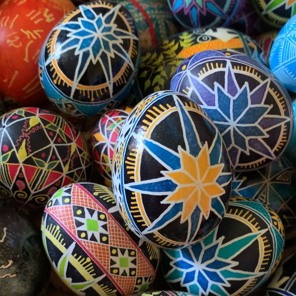
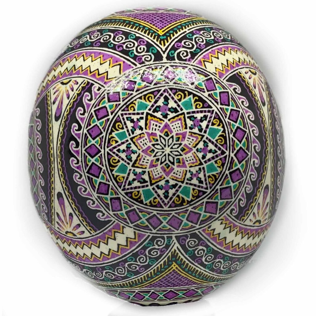
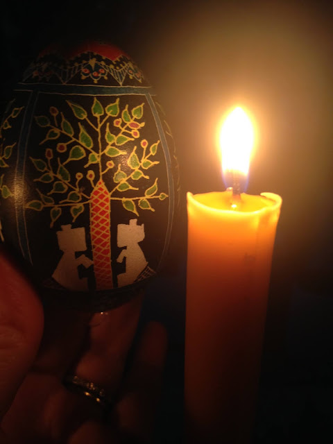
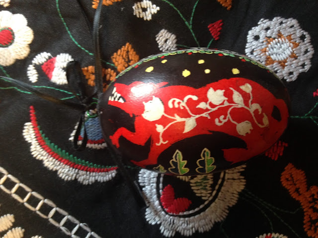
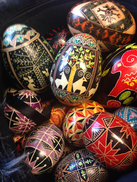
Pysanky, these Ukrainian Easter eggs are decorated using the wax-resist (batik) method. Covered in stunning motifs often taken from Slavic folk art
Pysanky (plural form of pysanka) is from the Ukrainian word “pysaty” meaning “to write.” Pysanky eggs are hand-drawn creations—first in pencil using guidelines to section off eggshells into a grid pattern, and then with detail within the grid. Afterward, pencil lines are covered with beeswax using a stylus or writing pen called a kistka and dipping in dyes of progressively darker shades. Similar to the batik work done on fabric. The last step is to remove the wax with a candle flame to reveal the beautiful design hidden beneath.
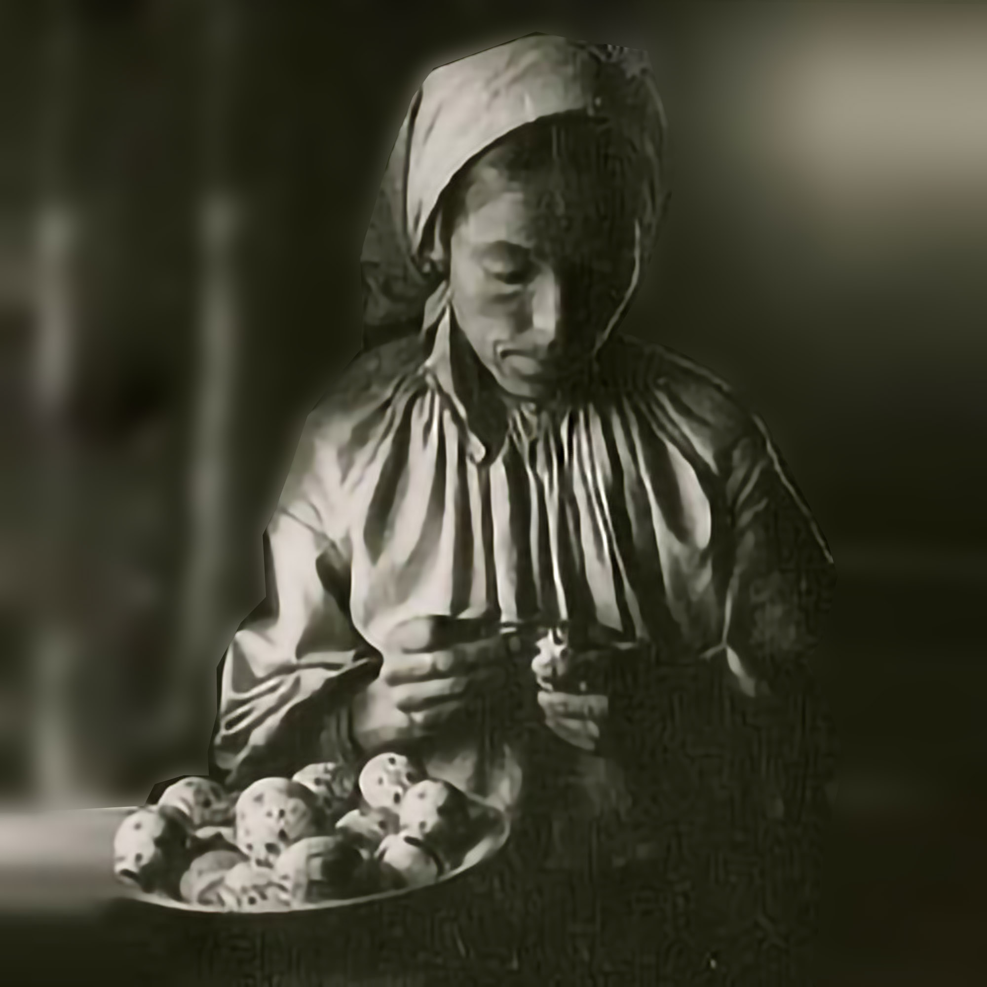
Egg Painter
circa 1930
Ukrainian Ethnological Center of the Maksym Rylsky Institute of Art
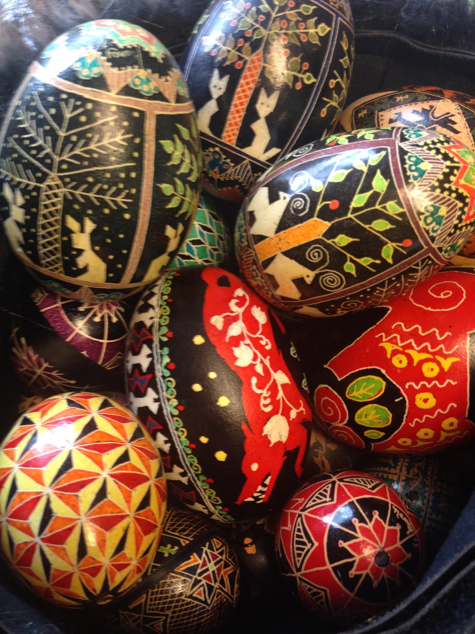
But the intricacy of the design is not the only thing that makes a pysanka beautiful. Even simple patterns can be just as striking as detailed ones. The key to beautiful traditional decorating for easter pysanka is symmetry and precision (although symmetry does not always play a role in contemporary patterns). By precision, I mean that the design is drawn within a grid that has been laid out meticulously, I use a lathe and see-through the ruler/stencil for drawing circles. If a pysanky is only divided in half, each half will measure exactly. Similarly, in quadrants, each will measure the same. The entire design, whether simple or detailed, depends on these first measurements to be exact. This is especially important if the egg will be very intricate.
If you have decorated an egg, then you have participated in one of the oldest decorative arts. Archaeologists have long known of egg art if the form of decorated ostrich shell pieces and empty eggs in Africa of great antiquity, found in tombs or archaeological digs, but they did not know how old this custom was. In 2010 an important find was announced that a team led by Pierre-Jean Texier found a cache of decorated ostrich eggs in layers in South Africa dating from 65,000 to 55,000 years before the present. They had been whole shells but crushed into fragments over time. These eggs were likely used for storing water, as hunter-gatherers of the Kalahari desert do even today. It is speculated that the designs might have been the mark of individual owners of the shells. An interesting find was that the scratched decorations on the eggs changed over time. Earlier eggs had cross-hatched designs that looked like railroad tracks. Later designs used finer parallel scratches inside of lines. Archaeologists have unearthed ceramic decorated eggs in Ukraine dating circa 3,000 B.C. For those ancients worshiping the sun god Dazhboh, decorated eggs were an affirmation of spring following a harsh winter. The eggs were also considered protection against illness and other forms of misfortune.
When Ukrainians adopted Christianity in circa 988, the practice of easter egg decorations continued but with the focus on Easter. Every egg coloring design has meaning. In the first century A.D. Christians took the ancient legend of the phoenix (one symbol of the sun to the Egyptians) as a sign of the resurrection[i]; in illustrations the bird stands on the egg from which it has risen. Hence, the Easter egg. The first color used to dye Easter eggs was red, symbolizing blood and its life-giving qualities. For several centuries early Christians observed all the traditional Jewish festivals, and thus Easter and Passover coincided. Colored eggs are also used in some Passover celebrations, but whether it was a tradition borrowed from Christianity or not remains a mystery. In ancient China eggs, dyed scarlet, were given as gifts in the spring. A circle represents the sun and integrity, also nature’s triumph over evil. Dots stand for the future. A star or “rosetta” is used to convey life itself, the source of light, beauty and perfection. Triangles are air, fire and water. Straight lines indicate eternal life.
There is meaning to the colors, too. White represents purity, birth, light and rejoicing. Green is fertility and hopefulness, the sun and life’s joys. Purple means faith, trust and patience. Black symbolizes constancy, eternity and the dark before dawn. Throughout history, eggs have been at various times magical, protective, divine — even evil, and they are an obvious fertility symbol. In Buddhist, Taoist and certain Russian rituals they are offered to the dead as representations of the revitalizing powers of nature.
I think the best learning egg dyeing videos are from Lorie Powpow master pasanky artist. Some tips of mine for in addition to Lorie are: 1) Double down on yellow aniline dye, 2) use a 1 tsp citric acid and 4oz of distilled water and submerge egg for 15min to remove egg membrane and make a perfect canvas, 3) use magic eraser Mr Clean sponge and a drop of water to remove pencil lines never use a rubber eraser. 4) if you love it invest in an electric kistka (wax pen).
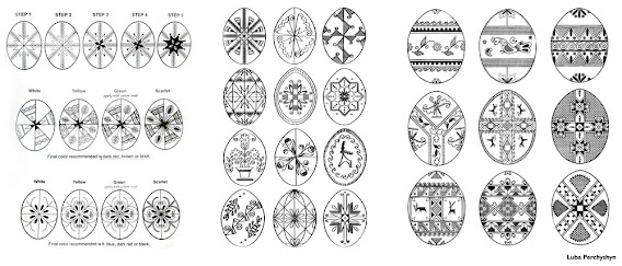
How to draw pysanky designs. Here below is a step by step illustration for a few easter egg designs for pdf download.
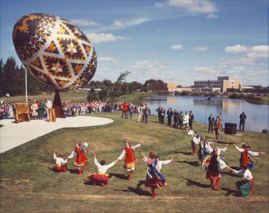
The sculpture was commissioned by the town of Vegreville, in the Canadian province of Alberta noted for its high Ukrainian Canadian population. In order to obtain funding for it, the town applied for a federal government grant and was eventually able to obtain some funding, but only if the sculpture was dedicated to the 1975 centennial of the Royal Canadian Mounted Police. Vegreville received a grant to construct the egg, a nod at Ukrainian culture in Canada,and specifically at early Ukrainian settlements east of Edmonton, AlbertaThese are the Best for Outdoor Activities They set up Quick and are a great shelter for Pysanky Workshops
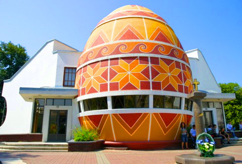
The current Pysanka Museum building was built in 2000 in the western Ukrainian city of Kolomyia, Ivano-Frankivska Oblast. Previously the pysanka collection had been housed in the Kolomyia church of the Annunciation. The museum is part of the National Museum of Hutsulshchyna and Pokuttya Folk Art. The central part of the museum is in the shape of a pysanka (Ukrainian Easter egg). This is the only museum in the world dedicated to the pysanka, and it has become a calling card of the city. In August 2007 the museum was recognized as a landmark of modern Ukraine.
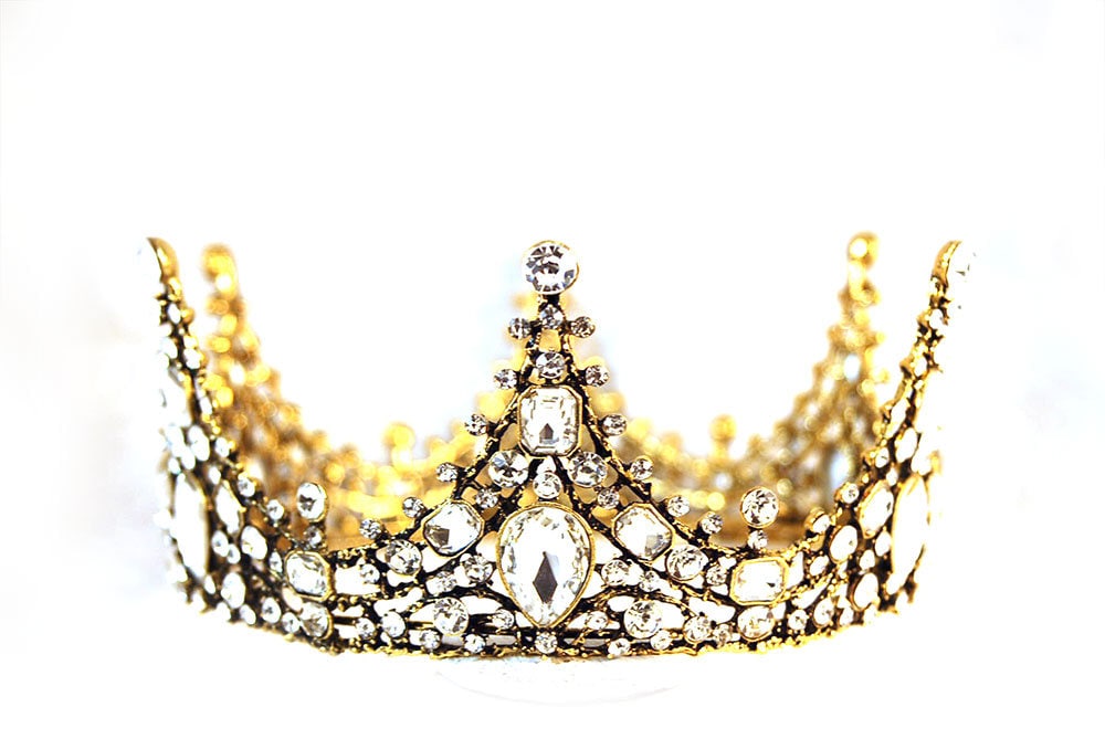
It’s no mystery that graphic designers wear many hats to get the job done. I fell into a side hustle of jewelry design and after some time taking care of an 8 and 10-year-old princess, crowns became a big thing. So I got to thinking and before you know it partnered up with a factory called CAFFEINE and created one. Introducing the ELIZABETH crown. A new product was created in collaboration with CAFFEINE Factory. We created some vintage-style baroque crowns inspired by Northwest European culture. Gold and diamond Swarovski crystal crown. The tiara is suitable for weddings or other celebrations, princesses, pageants, bridesmaids. Fabulous crown. Has a great weight and a lot of sparkles! A truly stunning tiara full of beautiful detailing with varying-sized crystals. Timelessly elegant, and breathtakingly gorgeous piece using the best materials available very high quality. nancystoreonline.com
Tiaras Baroque ELIZABETH Vintage Swarovski Crystal Wedding Crown
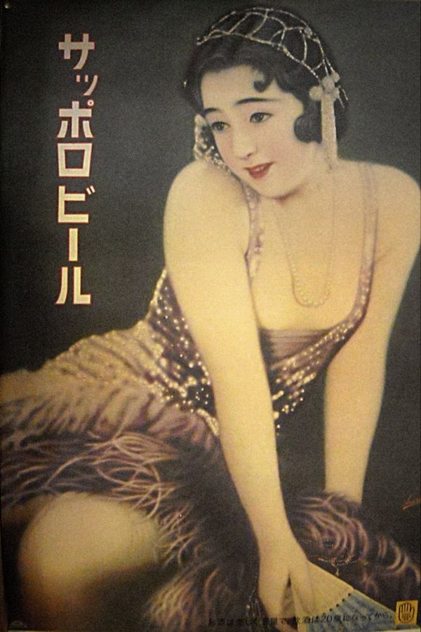
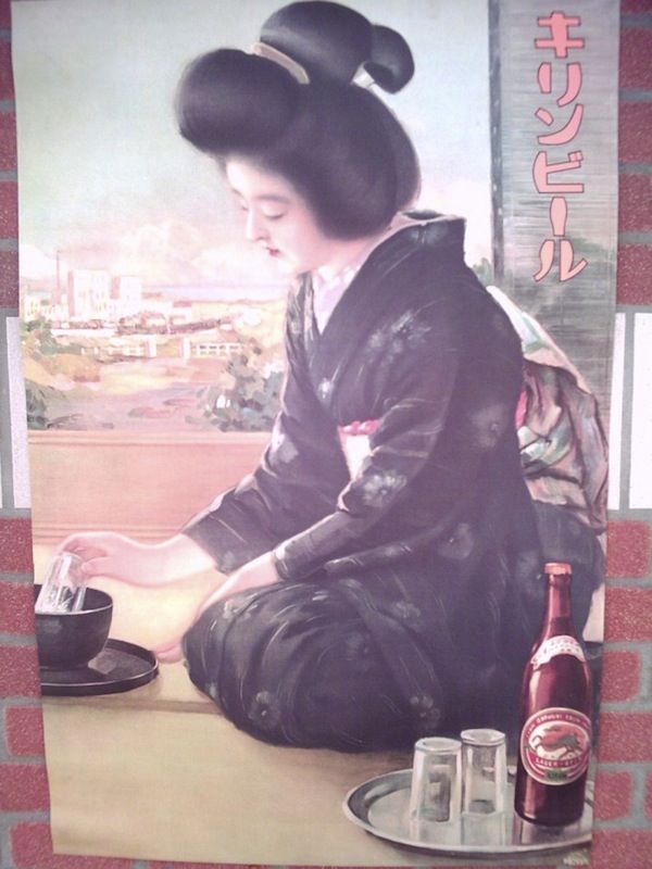
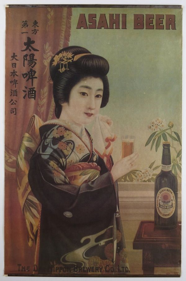
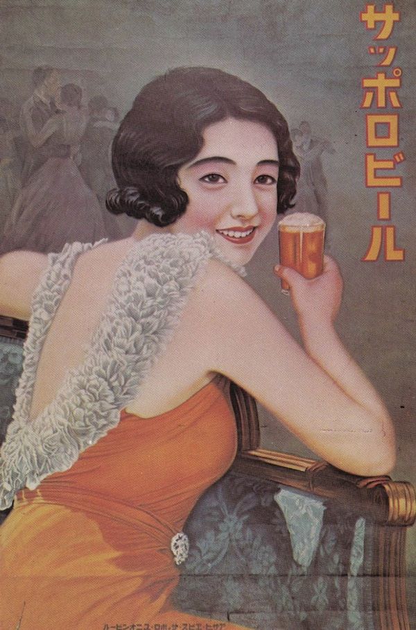
Gorgeous, Handmade Pre-War Japanese Beer Posters Feature Lovely Vintage Images
Recently a treasure trove of unearthed vintage advertising posters of gorgeous pre-war Japanese beer is discovered. In order to catch the eye of the audience Japanese beer companies had to use colorful posters. The posters are drawn, painted, and lettered by hand. The craftmanship took hours and the skill level was very high. While beer companies like Asahi, Kirin, and Sapporo are not known for their richly flavored malted products during that era, they are recognized for their richly evocative imagery used on their posters and postcards. If you spend enough time studying these posters carefully, you will realize that these brands often have the same girls featured on their posters, donning a different outfit.
Japanese Advertising History: Advertising is a window into society and people
Vintage advertising posters can be found at the Ad Museum Tokyo. Here the museum provides a good overview of the Showa Period 1926-1945 https://www.admt.jp/en/ A robust market now exists for these antique pieces of advertising and their suitable-for-framing reproductions.
Showa Period in Advertising 1926-1945
From the early days of Showa to the end of the war 1926〜1945 Continuing from the Taisho period, the early Showa period was referred to as “Showa Modern.” Advertising expression became more international and polished. As European and American cultural influences pervaded Japan, Japanese advertising became more refined, shifting toward tones of internationalism and modernism. At around this time the urban residents began enjoying the new customs and lifestyles that were introduced as people absorbed Western culture. Advertising communicated this change to a more enjoyable urban culture. This enjoyment drastically changed with the approach of war. Japanese advertising entered its “time of winter” as advertisements for regular products were swiftly replaced by promotions designed to boost national morale.
Source: Ad Museum Tokyo, Boing Boing, Colin Marshall, Melissa Goh #japanese #BeerPosters #vintageadvertising #handpainted #vintageadvertisingposters #handmade #showaperiod
Byzantine Iconoclasm and the Jansen Art text that we have all read gives a though account of the 9th century iconoclasm, but hearing modern examples of this recurring historical problem brings a fresh insight and new thoughts on the topic. Read the stories of Saltz, Griffin & Anderson authors who I have found to successfully represent a modern view of iconoclasm.
“The horrific paradox then is that these killers believe in the power and divinity of images, art, and architecture more than those who make the objects and who see what they make as abstract representations of ideas and things.”
Jerry Saltz
Here is the link to the article that I liked http://ow.ly/HfBOH Iconoclasm Now: CharlieHebdo and the Lethal Power of Art by @jerrysaltz
What is an example of iconoclasm?
Iconoclasm literally means “image breaking” and refers to a recurring historical impulse to break or destroy images for religious or political reasons. For example, in ancient Egypt, the carved visages of some pharaohs were obliterated by their successors; during the French Revolution, images of kings were defaced.
byzantine iconoclasm 9th century
‘Iconoclasm may even aid those who would benefit from cultural amnesia, under the guise of moving on’
Breaking an image does not eradicate it; it merely replaces it with another. Destruction is part and parcel of creation. Treasures from East Anglian Churches demonstrated just this fact: cruelly mutilated artworks had transformed into powerful warnings against the latent violence of political and religious dogma.
In the words of professional visual artist Suzy Rice- “The cover of that book pictured here to the left bears a reprint of the logo that I designed and drew, after it was redrawn by Lucasfilm, Ltd. (I believe that was done by Joe Johnson) with the flat-bottom “W” and the outline emboldened — both done by Lucasfilm, so it was explained to me by Producer Gary Kurtz, to improve readability of the logo in the main titles of the film (and all the rest that followed).
My logo was redrawn with some modifications but it was never replaced with a new design; or, more specifically, no “new design” was done by Johnson, he simply modified my design for predominantly production quality requirements when applied to the big screen.
Gary Kurtz called me at my work after they’d accepted my logo design for advertising purposes and informed me that he and George were going to use (my) logo, rather than the one they’d been up-to-that-point trying to use in the ongoing production of the film prior to release. My logo read better (was easier perceived by the viewer during the animated title treatment) than the one they’d originally intended to use but my logo required a bolder outline and a flattened W to improve on screen legibility during that quick pan (animated treatment) in the main titles. My response was great!”
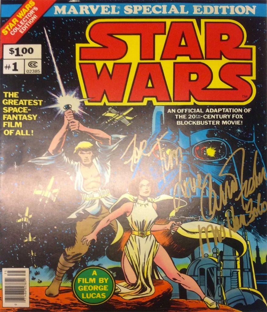
Star Wars #1 – signed Carrie Fisher – Marvel Treasury Comic $11,631.77 available
Graphic Design Girl Power
Finding out one of my childhood beloved movies also had a lead female graphic designer was a source of inspiration for me as I was learning design.
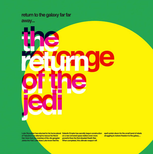
Fernando de Carabassa
These typographic Star Wars posters reimagine a galaxy far, far away in the style of Massimo Vignelli.
As these vivid typographic posters by Argentinian designer Fernando de Carabassa display, Helvetica and Star Wars might be a match made in heaven. It’s hard to put in words why this works. Thanks to that iconic title crawl, Star Wars is now famously recognized as using large blocks of clean text. It feels like a logical continuation to use colorful blocks of Helvetica to expand those title crawls into Word Art. De Carabassa’s designs use laid-out blocks of text and solid colors to evoke the imagery of the first three Star Wars movies: everything from the sight of two suns rising over the planet of Tatooine, to the crackle of a lightsaber igniting, to the barren, ice-cold world of Hoth. Star Wars, Helvetica, and typography might not be exactly related ideas in most people’s minds, but perhaps they should be.
Fonts similar to Helvetica: Free Alternatives & Similar Fonts
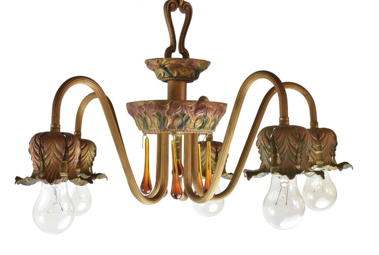
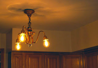
The Moe Bridges Chandelier arrived from the flea market with the bobeshes and beaded crystal trim missing. The wiring was from 1910 and the finish was irregular. I acquired the Art Deco Chandelier from a demolition expert working on a house in Sterling, Illinois. If you can find yourself a demolition expert in the midwest the restoration becomes affordable and worth it.
The whole project cost me 38$ not including paint and wiring. The Restoration of the polychrome arms was going to be tricky. I used a mild ketchup solution (that’s right ketchup!) which is great for cleaning paint. I left the ketchup on overnight and gently washed it away with warm water in the morning the brass and chrome were shining. Don’t use chemicals for cleaning paint you run the risk of removing it. The girls had a blast squeezing ketchup everywhere. The photographs speak for themselves.
I first started repainting the molded iron body. Matching the original color was not as hard as I thought in 1910 there were fewer enamel choices and the company Moe Bridges recorded the colors and they are readily available in many places. Next came the verdigris removal. I used a soft tip dremmel and took my time there was a minimaI amount of lost metal. Then I rewired using porcelain fittings and 16AWG UL wire with copper grounding.
Art Deco Chandelier Lighting can make or break your kitchen interior scheme make sure you take the time out to design for ambient, task, mood, accent, and decorative.
I’m about to install dimmer switches their inexpensive and can give me a wide range of ambient overhead chandelier options. This bolsters my light from the 2′ x 4′ skylight I have. Next is ‘Task’ lighting to ensure safe food prep’ built-in light is under the cabinets. I have an open-concept kitchen. Using ‘Mood’ lighting is a great way to solve the problem. Battery-timed wall sconce candle is a great choice for mood lighting. Avoid fabric-covered lighting ideas as these absorb grease and smells and keep lamps off counters to free up work zones.
Gyeongju, the capital of the kingdoms of Old Silla the Golden Kingdom of Korea (57 B.C.–668 A.D.) and Unified Silla (668–935), is dotted with impressive mounds of royal tombs. Their occupants range from kings, queens, and princes to relatives and nobility blessed into the inner circles of power.
From the time of their construction, the tombs of Silla the Golden Kingdom of Korea have stood as symbols of political authority and cultural grandeur. Beyond objects of splendor, gold ornaments from Silla tombs also served as status symbols. Whereas gold earrings, necklaces, bracelets, and rings were appropriate accessories for both royalty and nobility, gold crowns and belts were reserved for the royal family. Furthermore, the objects’ quality and design reflected the social and political rank of the deceased, so that a king’s cache is indisputably more dazzling and complex than those of royal kin or an aristocratic leader. To some degree, burial objects were also gender-coded. Decorative swords, for example, have been found only in the tombs of males. In general, however, many jewels, including elaborate earrings and necklaces, were made for members of both sexes. The Silla practice of building large mound-tombs and interring scores of gold ornaments gradually declined following the official adoption of Buddhism as the state religion in 528. Instead, cremation became the standard postmortem practice. Accordingly, urns replaced jewelry as the main burial accouterment. By the end of the sixth century, opulent ritual accessories made of gold and other precious metals were destined for Buddhist temples rather than royal tombs.
Limited editions of jewelry inspired pieces from the Silla the Golden Kingdom of Korea Kingdom can be found at my store nancystoreonline.com
Gold Earring Ornaments At the Bomundong Double Burial in Gyeongju and the ones in Geumjochong Tomb in Yangsan excavation.
You can check out more about the National Museum of Korea here and see how to get there using public transports. It is in Seoul, so it is quite easy to find. For more in depth information on my graphic design click here
source: Jansen Art History Text, National Museum of Korea #GoldSilla #NationalMueamKorea #ancientjewelry #ancientgold #Gyeongju
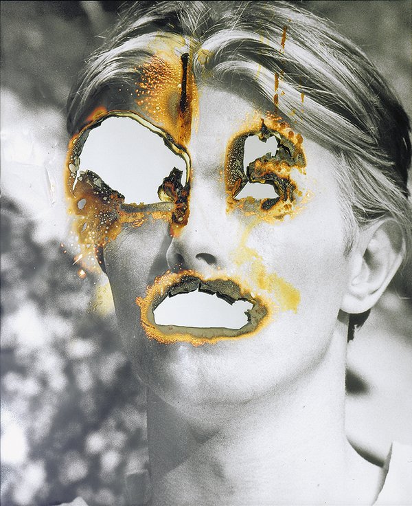
Empathy pervades both art-making and the experience of looking at art. Collage is a medium that offers a quick response for the technique of automatism.
Artists can increase empathy in others through their work, eliciting that feeling from people who may be numb from all the terrible things going on in the world, making the viewer more sensitive and vulnerable.
The Center for Building a Culture of Empathy describes empathy in four stages: self-empathy, or mindfulness of what’s going on inside oneself; mirrored empathy, meaning taking on another person’s emotion; imaginative empathy, which involves putting yourself in another person’s shoes; and empathic action, i.e., contributing to the well being of others. All of these aspects can play a role in art-making.
“Artists try to make a gift of what they have felt, What they have felt is the aggregate of what they have seen, and so it includes their own imaginings of what others have thought and felt.”
JESSE BALL
In the 1800s, philosophers of aesthetics wondered why art pleased people, and they came up with the idea that art activates viewers’ memories and emotions. The concept of ideasthesia used by artists also raises a question: Can we use ideasthesia to formulate a theory of art? The relationship between the two opposing forces of ideasthesia, i.e., the concept and the sensation, can be used to formulate a hypothesis about psychological events that underlie the process of either creating an art piece or appreciating (i.e., consuming) it[1]. So, empathy was the mysterious element that connected art and the viewer. In 1873, German aesthetics student Robert Vischer described this projection of emotion as einfühlung, “feeling into,” and, in 1909, British psychologist Edward Titchener translated the word into English as “empathy.” John Dewey’s notion of imagination being indispensable to all learning can be seen to be a “pathway” to empathy. Freud argued that psychoanalysts should embrace empathy to understand their patients.
Surrealist Automatism is a method of art-making in which the artist suppresses conscious control over the making process, allowing the unconscious mind to have great sway. Early 20th-century Dadaists, made some use of this method through chance operations.
“Artists, as a whole, are more empathic than non-artists. They’re more sensitive. They tend to have more fluid, permeable personal boundaries that allow them to connect to people in meaningful, emotional ways. That connection provides fuel for the creative process.”