As to the potential and versatility that digital devices provide, there’s nothing like sitting down with a good book.
With all the various forms of printed media, it is an occasional relief to pick up something tactile once in a while to read. Nothing else compares to this print form. It sets out everything you need to know in an organized and complete way that ensures that nothing essential gets left out. Whether you’re interested in studying the fundamentals of graphic design or developing your existing skills, it’s worth investing in some excellent design books. Here are my favorites.
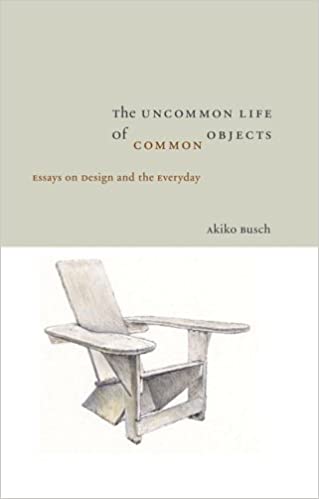
1) The Uncommon Life Of Common Objects: Essays on Design and the Everyday Hardcover – by Akiko Busch
A look at how design influences and responds to our changing lives, and a study of society and its values and the infusion of meaning into inanimate objects.
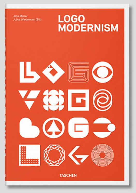
2) 4. Logo Modernism (Design) – Jens Muller, R. Roger Remington
When we start analyzing the aesthetics for architecture and art then apply them to product design we recognize a time of vast technological advance that affirms the power of human beings to reshape their environment and to break from the conventions or constraints of the past. From 1940-1980 this book takes a comprehensive look at the scope of post-modernism attitudes that gave birth to the concept of corporate identity.
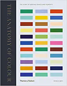
3) Anatomy of Color: The Story of Heritage Paints & Pigments by Patrick Baty
Colour is a fundamental part of design, but knowing how to use it is also about learning its deep historical roots and how colour functions within a society as custom. I think all creatives should read this comprehensive and detailed book, focusing on the use of colour in decoration for over 300 years. Patrick Baty is a combination of skills such as historian, detective, and analyst. He traces the evolution of pigments and paint colours, and examines their impact on the colour palettes used in interiors. In doing so, he highlights the characteristic colour trends and styles of painting particular to each time period in interior design.
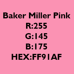
Baker-Miller Pink Hex FF91AF Frequently Called Baker Miller Pink Paint or P-618
The Baker Miller Pink Study Appetite Suppressant In 1979, Dr. Alexander G. Schauss, experimented with the use of a particular shade of pink and its effect on mood and behavior. The color is frequently called baker miller pink paint. It was found that this pink color was associated with a short-term decrease in aggression.
Baker-Miller. They “observed relaxation of the subjects when they stared at an 18 by 24-inch cardboard plate” of this color of pink. They found that no other color consistently resulted in the same relaxation. Dr. Schauss then did some experiments on himself. He observed that his blood pressure, pulse, and heart rate were unaffected by exposure to this shade of pink. However, “after intentionally increasing cardiovascular activity through a series of intense physical exercises, [he] found that this color had a marked effect on lowering [his] heart rate, pulse, and respiration as compared to other colors.”
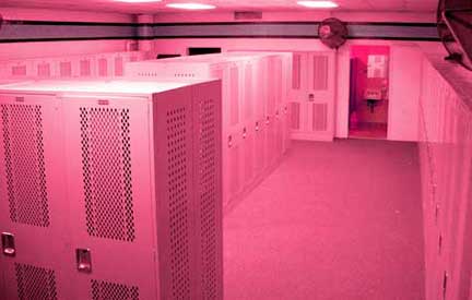
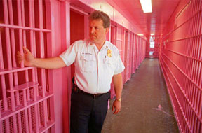
visitors locker room at University of Iowa pink prison Commander Miller and Warden Gene Baker at the U.S. Naval Correctional Center in Seattle painted the prison cells the color pink that Dr. Schauss would later name after them.
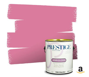
Prestige Paints Interior Paint and Primer In One, 1-Gallon, Semi-Gloss, Comparable Match of Sherwin Williams* Impatient Pink* Prestige Paints has created a comparable color based on color specifications of the original color Baker Miller Pink using industry leading technology.
Stress Relief If you are stressed, you may want to look at a page of Baker-Miller Pink to see if it relaxes you. If it does you can print the page and carry it with you to look at any time you need some stress reduction. The exact color of Baker-Miller Pink was experimented with by Strauss. Hundreds of shades of pink were sorted through. He finally zeroed in on the color that he named Baker-Miller pink as the one which gave the most consistent results in “reducing hyperexcitability.” Could Baker-Miller Pink Also Reduce Aggression? He then wondered that, since the color pink could reduce his heart rate, blood pressure, and pulse (when they were intentionally elevated), could it affect aggressive behavior?
He attempted to convince officials at the Washington State Department of Corrections to try painting the receiving rooms at a correctional facility the color pink to determine if it had any effect on aggressive behavior. Not surprisingly, officials balked at his color suggestion. However, two brave soles were willing to give it a try. In 1979, Commander Miller and Warden Gene Baker at the U.S. Naval Correctional Center in Seattle painted the walls and ceiling of one admissions cell the color pink that Dr. Schauss would later name after them. After 156 days, they reported to the U.S. Navy’s Bureau of Naval Personnel, Law Enforcement and Corrections Division, Washington, D.C. that “Since the initiation of this procedure on March 1, 1979, there have been no incidents of erratic or hostile behavior during the initial phase of confinement.” They found that an exposure of 15 minutes or less was all that was needed to reduce aggression in the detainees. They also discovered that the effect lasted at least another 30 minutes after leaving the Pink Room, which made it easier for the officials to complete their paperwork and assign the detainee to a permanent cell without having to deal with aggressive behavior. Reduction in Strength Dr. Schauss also discovered that the calming effect reduced the strength of the subjects. Experiments were conducted which demonstrated that people were able to lift less weight after gazing at Baker-Miller Pink than they could before they looked at it. In the 1980’s the television show ‘That’s Incredible’ had men gaze at a blue poster, then a pink one. After gazing at the pink one, they were able to hold less weight in their outstretched arms. This reported loss of strength has been used in interesting ways.
As reported in “The Hawk Eye,” May 26, 1998, when Hayden Fry, was the coach of the University of Iowa’s football team, he had the visiting team’s locker room painted pink in an attempt to make the other team weak and less aggressive. The Western Athletic Association put a stop to that by making a rule that the home team and visiting locker rooms could not be painted different colors. Baker-Miller Pink – a Natural Appetite Suppressant The U.S. Naval Office of Research in Washington, D.C. conducted further research over the next four years at the Health, Weight, and Stress Clinic at John Hopkins University Hospital in Baltimore, Maryland. These experiments were overseen by Maria Simonsen, M.D., the Clinic’s Director. Experiments on stress reduction by the use of Baker-Miller Pink were conducted on 1,700 subjects. They found another interesting effect. The subjects who were there for stress reduction reported Baker-Miller Pink to be an appetite suppressant. Experiments on other subjects who were there not seeking stress reduction but rather a method of weight control confirmed the same results in one-third of the subjects.
Dr. Schauss then conducted further research in 1979 at the Santa Clara, California, County Jail. The first day the staff left inmates in painted pink cells with Baker-Miller Pink for several hours. The inmates scratched the paint off the walls with their fingernails! “Otherwise, no aggressive or aberrant behavior was observed.” After that, they limited the time to 15 minutes. The experiments gathered more information. First, they learned that the color was far more effective in an 8′ X 10′ cell than in the larger holding cell. Second, they learned that the color was more effective with only one inmate in the room. Experiments on Psychiatric Patients Later that year, at the Veterans Administration Medical Center, Los Angeles, Adam Coutts, Chief of Management Sciences conducted experiments with psychiatric patients. He painted rooms in the psychiatric ward different colors. One of them was painted Baker-Miller Pink. “After several months of study, he felt enough evidence had been collected to support the U.S. Naval Correctional Center’s findings that he advocated the need for a long term study.” Remarkable Results With Aggressive Youth. New Observations After this, experiments were conducted by Chief Clinical Psychologist, Paul Boccumini, Ph.D., Director of Clinical Services at the San Bernadino, California, County Probation Department. At the Kuiper Youth Center, he assigned staff nurses to observe the subjects. They placed 27 “obstreperous youth” in rooms painted Baker-Miller Pink. The rest were placed in other colored rooms. They made significant new observations during this experiment. After 2-3 minutes in the Pink Room, subjects became less verbally aggressive. This was true “regardless of the degree of aggressive verbal or physical behavior” before being placed in the rooms. After 5-6 minutes, “each youth would desist from using either physical violence (i.e., kicking the door, hitting or pounding of the walls, etc.) or continue self-mutilative behavior.” After 8-9 minutes, “each youth would assume a relaxed sitting position or lay on his or her back, spread out on the floor while frequently looking at the ceiling.” Within 10 minutes, “each youth sufficiently calmed down so that he or she could be returned to the main hall.”
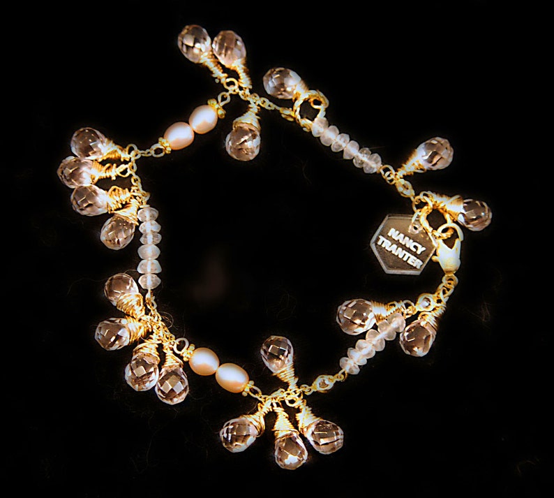
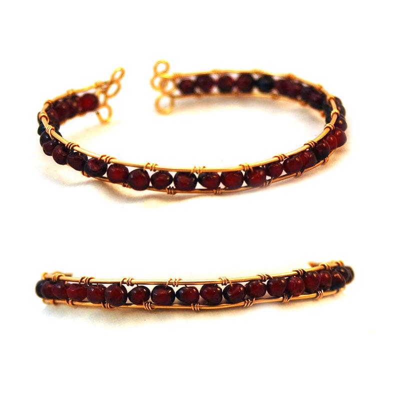
Pink Rose Quartz, Crystal, Pearl and 12K gold Bracelet $65.00 nancystoreonline.com
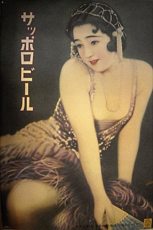
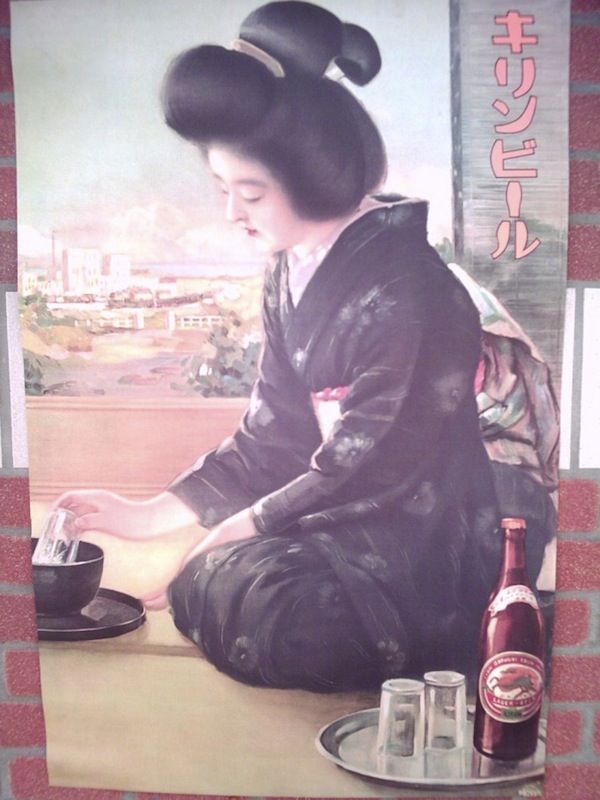
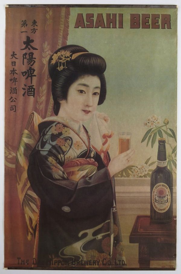
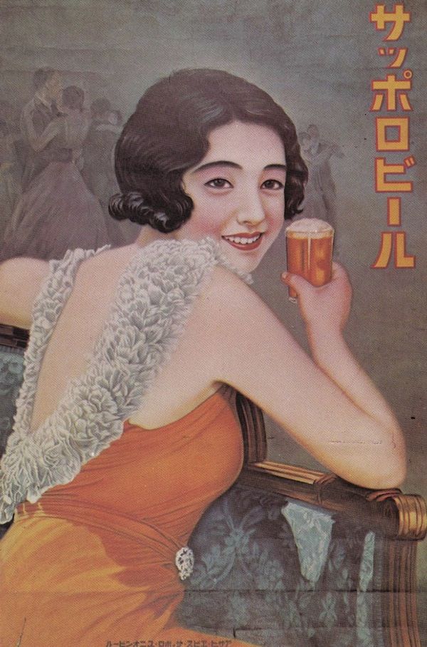
Gorgeous, Handmade Pre-War Japanese Beer Posters Feature Lovely Vintage Images
Recently a treasure trove of unearthed vintage advertising posters of gorgeous pre-war Japanese beer is discovered. In order to catch the eye of the audience Japanese beer companies had to use colorful posters. The posters are drawn, painted, and lettered by hand. The craftmanship took hours and the skill level was very high. While beer companies like Asahi, Kirin, and Sapporo are not known for their richly flavored malted products during that era, they are recognized for their richly evocative imagery used on their posters and postcards. If you spend enough time studying these posters carefully, you will realize that these brands often have the same girls featured on their posters, donning a different outfit.
Japanese Advertising History: Advertising is a window into society and people
Vintage advertising posters can be found at the Ad Museum Tokyo. Here the museum provides a good overview of the Showa Period 1926-1945 https://www.admt.jp/en/ A robust market now exists for these antique pieces of advertising and their suitable-for-framing reproductions.
Showa Period in Advertising 1926-1945
From the early days of Showa to the end of the war 1926〜1945 Continuing from the Taisho period, the early Showa period was referred to as “Showa Modern.” Advertising expression became more international and polished. As European and American cultural influences pervaded Japan, Japanese advertising became more refined, shifting toward tones of internationalism and modernism. At around this time the urban residents began enjoying the new customs and lifestyles that were introduced as people absorbed Western culture. Advertising communicated this change to a more enjoyable urban culture. This enjoyment drastically changed with the approach of war. Japanese advertising entered its “time of winter” as advertisements for regular products were swiftly replaced by promotions designed to boost national morale.
Source: Ad Museum Tokyo, Boing Boing, Colin Marshall, Melissa Goh #japanese #BeerPosters #vintageadvertising #handpainted #vintageadvertisingposters #handmade #showaperiod
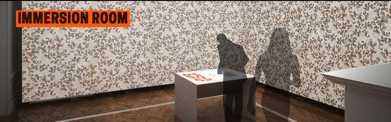
Immersion Room using digital and projection technologies
This exhibition makes you feel like a genius. The Immersion Room on the second floor uses digital and projection technologies to bring the museum’s collection of wallcoverings, the largest and most notable in North America to life. Visitors who come to the Cooper Hewitt Museum receive an interactive pen, an all-access pass to the world of design. Visitors use the pen to copy any object in the museum and save it to their collection or experiment with creating their own designs.
CHM Press release- “This interactive space, formerly Margaret Carnegie’s bedroom, offers a unique experience: the ability to view Cooper Hewitt’s extraordinary collection of wallcoverings as never before. You can select wallpapers from the Museum’s permanent collection and see them projected on the walls from floor to ceiling—for a vibrant, impactful, immersive sensory room experience. You can even play designer by creating your designs, or just stand back and watch as the wallpapers unfold across the immersive room. More than just entertainment, the Immersion Room provides the first opportunity to discover Cooper Hewitt’s wallcoverings as they were intended to be viewed.
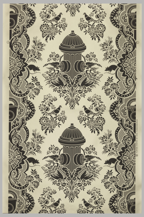
A damask-style sidewall design called “City Park” (2007) that contains strikingly modern imagery, including a fire hydrant, parking meter, pigeons and rats
To complement the experience, several wallpapers are accompanied by audio clips. When you select one of these designs, an audio recording plays through speakers in the room, giving you additional information about that particular design or designer.
The experience is yet another way the new Cooper Hewitt is remaining true to the vision of its founders, Sarah and Eleanor Hewitt, who intended it as “a practical working laboratory,” where students and designers could be inspired by actual objects. Their 1897 vision of a museum and collection “for anyone who wanted to use it as a place to work and learn” seems radical, even by today’s standards, but it has guided the transformation of Cooper Hewitt into a design museum for the 21st century.”
Check out some of my favorite wallpapers and where to buy them on my pinterest
Byzantine Iconoclasm and the Jansen Art text that we have all read gives a though account of the 9th century iconoclasm, but hearing modern examples of this recurring historical problem brings a fresh insight and new thoughts on the topic. Read the stories of Saltz, Griffin & Anderson authors who I have found to successfully represent a modern view of iconoclasm.
“The horrific paradox then is that these killers believe in the power and divinity of images, art, and architecture more than those who make the objects and who see what they make as abstract representations of ideas and things.”
Jerry Saltz
Here is the link to the article that I liked http://ow.ly/HfBOH Iconoclasm Now: CharlieHebdo and the Lethal Power of Art by @jerrysaltz
What is an example of iconoclasm?
Iconoclasm literally means “image breaking” and refers to a recurring historical impulse to break or destroy images for religious or political reasons. For example, in ancient Egypt, the carved visages of some pharaohs were obliterated by their successors; during the French Revolution, images of kings were defaced.
byzantine iconoclasm 9th century
‘Iconoclasm may even aid those who would benefit from cultural amnesia, under the guise of moving on’
Breaking an image does not eradicate it; it merely replaces it with another. Destruction is part and parcel of creation. Treasures from East Anglian Churches demonstrated just this fact: cruelly mutilated artworks had transformed into powerful warnings against the latent violence of political and religious dogma.
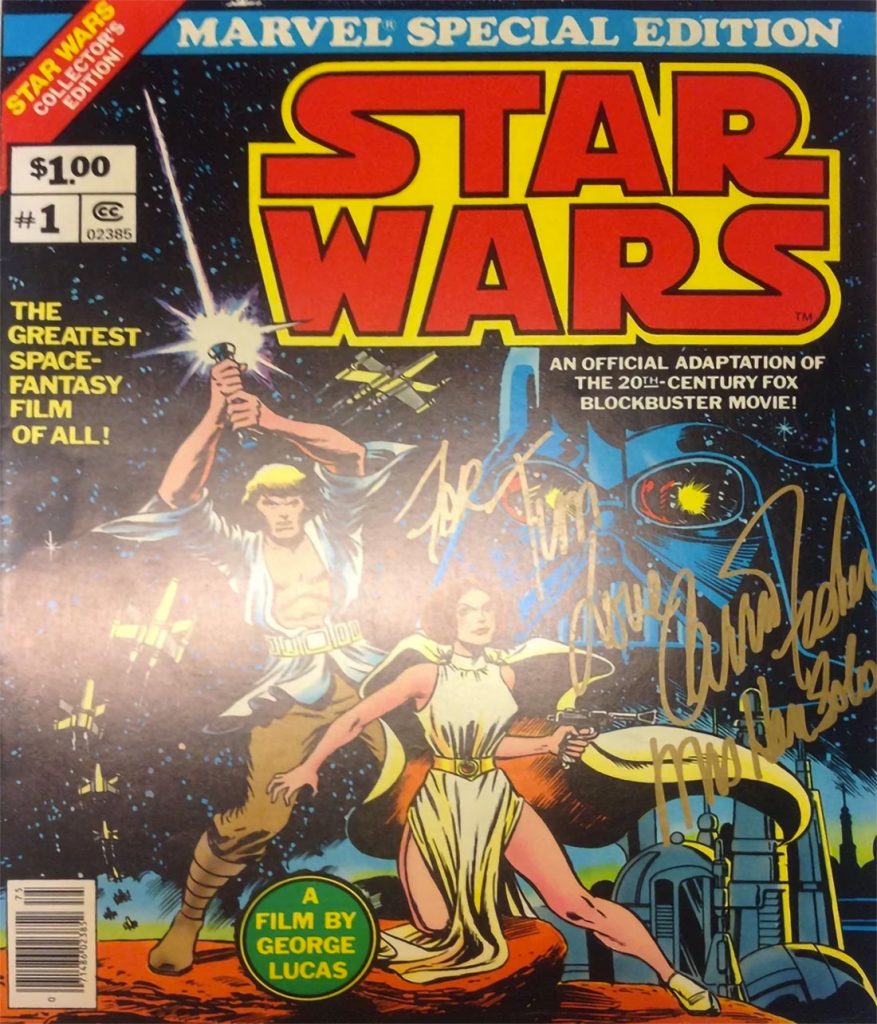
In the words of professional visual artist Suzy Rice- “The cover of that book pictured here to the left bears a reprint of the logo that I designed and drew, after it was redrawn by Lucasfilm, Ltd. (I believe that was done by Joe Johnson) with the flat-bottom “W” and the outline emboldened — both done by Lucasfilm, so it was explained to me by Producer Gary Kurtz, to improve readability of the logo in the main titles of the film (and all the rest that followed).
My logo was redrawn with some modifications but it was never replaced with a new design; or, more specifically, no “new design” was done by Johnson, he simply modified my design for predominantly production quality requirements when applied to the big screen.
Gary Kurtz called me at my work after they’d accepted my logo design for advertising purposes and informed me that he and George were going to use (my) logo, rather than the one they’d been up-to-that-point trying to use in the ongoing production of the film prior to release. My logo read better (was easier perceived by the viewer during the animated title treatment) than the one they’d originally intended to use but my logo required a bolder outline and a flattened W to improve on screen legibility during that quick pan (animated treatment) in the main titles. My response was great!”
Star Wars #1 – signed Carrie Fisher – Marvel Treasury Comic $11,631.77 available
Graphic Design Girl Power
Finding out one of my childhood beloved movies also had a lead female graphic designer was a source of inspiration for me as I was learning design.
Fernando de Carabassa
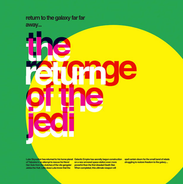
These typographic Star Wars posters reimagine a galaxy far, far away in the style of Massimo Vignelli.
As these vivid typographic posters by Argentinian designer Fernando de Carabassa display, Helvetica and Star Wars might be a match made in heaven. It’s hard to put in words why this works. Thanks to that iconic title crawl, Star Wars is now famously recognized as using large blocks of clean text. It feels like a logical continuation to use colorful blocks of Helvetica to expand those title crawls into Word Art. De Carabassa’s designs use laid-out blocks of text and solid colors to evoke the imagery of the first three Star Wars movies: everything from the sight of two suns rising over the planet of Tatooine, to the crackle of a lightsaber igniting, to the barren, ice-cold world of Hoth. Star Wars, Helvetica, and typography might not be exactly related ideas in most people’s minds, but perhaps they should be.
Fonts similar to Helvetica: Free Alternatives & Similar Fonts
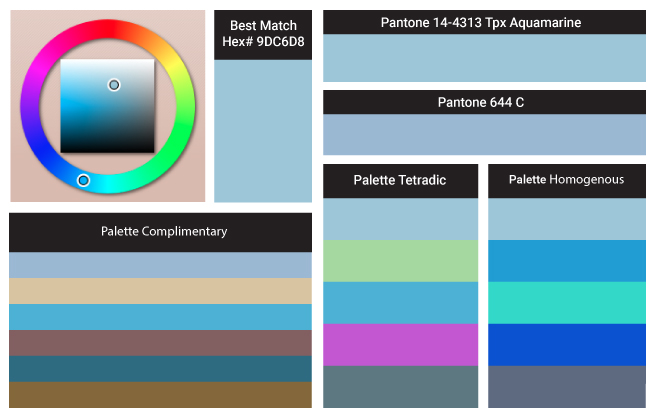
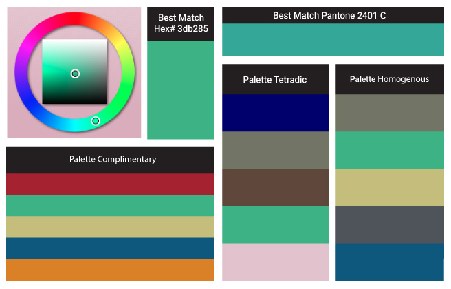
Here we have Aquamarine Color of the Year schemes, paints, palettes, combinations, gradients and color space conversions.
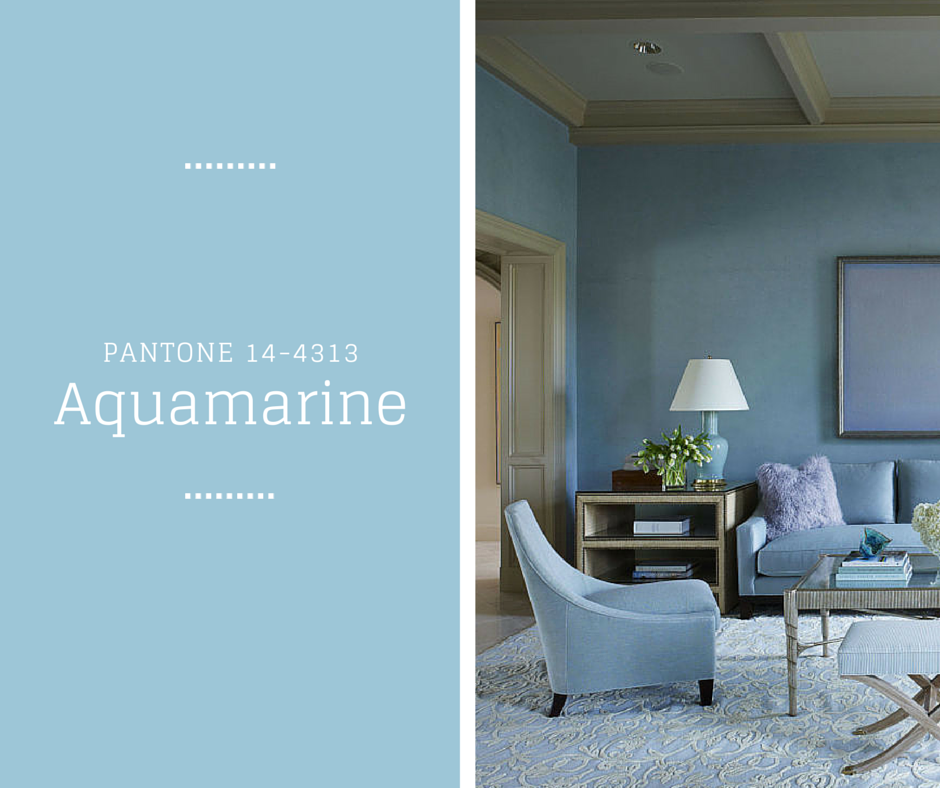
Pantone’s Aquamarine hexadecimal color code is #9dc3d4 this is a medium light shade of cyan. In the RGB color model #9dc3d4 is comprised of 61.57% red, 76.47% green and 83.14% blue. In the HSL color space #9dc3d4 has a hue of 199° (degrees), 39% saturation and 72% lightness. This color has an approximate wavelength of 484.57 nm. The lead color for women for the Spring/Summer 2015 season, PANTONE 14-4313 Aquamarine is an airy blue with a dreamy feel. Cool and calming, ethereal Aquamarine is a shade with a wet and watery feel.
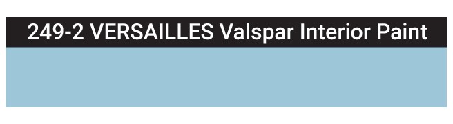
Matching Digital Colors to Actual Paint Colors
Have you ever seen the perfect color on your wanderings? Your next project is how to translate the color you found into interior house paint. I am asked as a designer to select paint colors for my clients based on a digital image emailed to me or found on a website. Factors like scale, lighting, reflection and existing items influence color selection making it a multi-step task. So how do you start? Let me share my findings for Aquamarine. Here is the closest match that I approve of 249-2 VERSAILLES Valspar Interior Paint.
Calm, cool, and delicate, warm tones describe the color trends this spring 2015 season, as mother nature brings so much beauty and a sense of relaxation. A relaxing and airy theme that Aquamarine Blue carries, washes away those winter blues and reinvents a new you; away from cold and into the sunshine.
An invigorating and powerful Scuba Blue that brings along the fun, resembles the clear waters of Greece. This cool shade brings you to paradise or at least makes you feel as though you are there, if you have been dreaming of Spring to finally be here.
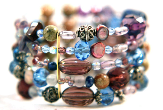
The reflection of the faceted beads is stunning. You will stand out with this bracelet because of its visual impact of colors and materials. These bracelets consist of a memory wire that wraps around your wrist. Different materials for this bracelet include Sterling silver beads and bead caps. Gemstones, Swarovski faceted beads that are fire-polished, freshwater pearls, glass round and faceted beads, acrylic beads. Fits almost any wrist size.
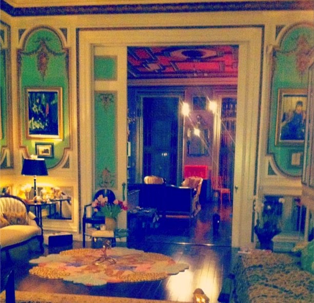
Apartment in Washington Square 2015 photo by Zac Posen
Sit back and enjoy these beautiful living room paint colors
The above living room paint colors are examples from fashion designer Zac Posen. Zac became known for his glamorous ball gowns and has dressed everyone from Rihanna to Sarah Jessica Parker to Oprah Winfrey. He was raised in SoHo, Manhattan, New York. He has previously stated that his love of fashion began when he used to steal the yarmulkes at his grandparents’ synagogue because he wanted to make dresses for dolls. At 16, he enrolled in Parsons School of Design’s pre-college program, and he was given the opportunity to intern with fashion designer Nicole Miller. On November 1, 2019, House of Z and Z Spoke, the fashion brand owners of Posen’s company, announced an immediate closure of the label. In 2021, Posen has recently released a collection of genderless wedding rings.
Zac is serving up some living room paint color design ideas and photos to inspire our home decor choices. Stepping into this Washington Square Park apartment in Manhattan, you might think the sun king Louis XIV lived there. The home filled with incredible architectural details. Bright turquoise and gold gilded plaster cover the walls of a parlor. This home has an elegant, traditional feel—which makes it full of potential.
Interior design color choices for architectural highlights
The interiors aren’t the only standout feature of the apartment. There are many beautiful details, including a wood-inlaid ceiling with walnut and atomic red paint color. Hiding inside the walls are pocket doors with gold gilding on wood. The black trimmed furniture sits like a background playerthroughout. Stunning craftsmanship, and the parlor has an airy vibe that I adore (perfect for the Project Runway judge). This incredible space is the epitome of fun for cousins, friends, or even adults. The vibrant colors are perfect for your living room paint color choices.
Inspired by the antique Washington Square apartment I applied the turquoise and red color palette to my front door.The color is Sherwin-Williams Nifty Turquoise. The wreath was made by me nancytranter.com
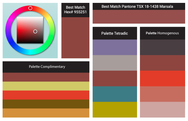
Color of the Year’s Chemistry and What’s Behind Pantone’s Marsala 18-1438
Marsala enriches our mind, body and soul, exuding confidence and stability. Much like the fortified wine that gives Marsala its name, this tasteful hue embodies the satisfying richness of a fulfilling meal, while its grounding red-brown roots emanate a sophisticated, natural earthiness. This hearty, yet stylish tone is universally appealing and translates easily to fashion, beauty, industrial design, home furnishings and interiors.
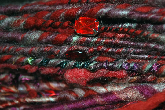
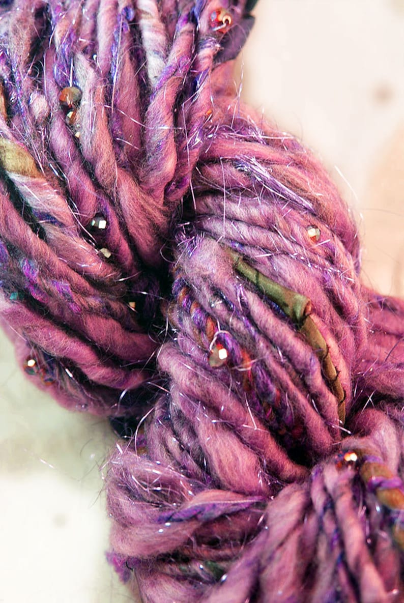
Marsala is a one of a kind art yarn that I spun. The thick and thin art yarns look amazing in finished products! Handspun corespinning is a slow spinning technique which results in the yarn looking very different from a traditional single. The fibers are allowed to wrap around a core thread at a 90 degree angle, it allows the spinner to create a very strong, soft, warm and lofty yarn. however due to the longer time it takes to create a Corespun yarn the cost is higher.
This Yarn is bulky so I like to knit on a size US 10 but you can knit on any size! Thats the beauty of Art Yarn. The cotton, acrylic, wool blend is based on Marsala PANTONE 18-1438. Covered in garnet colored crystal, freshwater pearls, semi precious carnelian, silk ribbons, gold fibers and some gorgeous other found objects. The inspiration came from Byzantium’s vibrant and energetic color palette jewel tones of red and gold with the pop of white pearls. Woven on a very strong nylon cord.
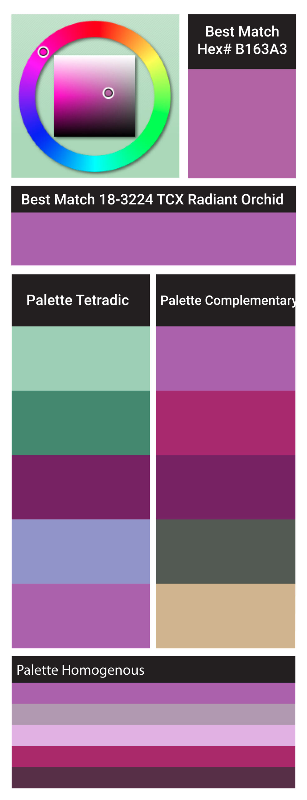
Expressive, exotic 18-3224 Radiant Orchid blooms with confidence and warmth
Pantone, an X-Rite company and the global authority, today announced Color of the Year PANTONE® 18-3224 Radiant Orchid, a captivating, magical, enigmatic purple, as the color of the year for 2014. “While the 2013 color of the year, PANTONE 17-5641 Emerald, served as a symbol of growth, renewal and prosperity, Radiant Orchid reaches across the color wheel to intrigue the eye and spark the imagination,” said Leatrice Eiseman, executive director of the Pantone Color Institute®. “An invitation to innovation, Radiant Orchid encourages expanded creativity and originality, which is increasingly valued in today’s society.”
“An enchanting harmony of fuchsia, purple and pink undertones, Radiant Orchid inspires confidence and emanates great joy, love and health. It is a captivating purple, one that draws you in with its beguiling charm.” Download the Pantone report for spring 2014
Bracelet Radiant Orchid Mix Gemstones Memory Wire Wrap $45.00Artisanal Yarn available at nancystoreonline.com
Pantone color of the year radiant orchid color analysis
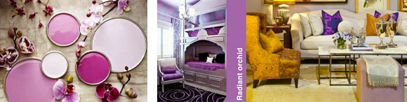
I’m excited by radiant orchid because this fuchsia pinky purple is one of my all time favorite colors! I’ve collected several radiant orchid beauty pieces to share with you.
This color of the year is bold, inspiring and fueled with adventure, its showing up on runways and into living rooms across the nation. Individuals drawn to this color are known to be imaginative, creative and original. While this bright hue may not be suited for the faint at heart, don’t feel intimidated to try it out, as it evokes sophistication and confidence. Bright colors like this can pop a punch into your everyday style you can try infusing the color into your look by painting your nails or tie your ensemble together with an orchid bracelet. My store nancystoreonline.com offers a variety of jewelry pieces, all accented with sparkling semi-precious gemstones. So whether you’re putting together an outfit, or combining it into other aspects of your life, remember to get inventive and have fun with it!