Fall 2013 Color Trends invokes colors that are rustic, warm but bright and dull all in one. It speaks of some of our favorite shades. The fashion color report for Fall 2013 has been unveiled by Pantone LLC. This vivacious palette gives us a direction to the overview of designers’ use of color in their upcoming collections.

Released on the first day of New York Fashion Week, the PANTONE Color Trends Report features the top 10 colors for women’s and men’s fashion for fall 2013, along with designer sketches, quotes, and headshots. The colors come together to create moods that range from sophisticated and structured to lively and vivid. They encapsulate our inherent need for wardrobe variety to reflect emotions that run from thoughtfully introspective to irrepressibly elated.
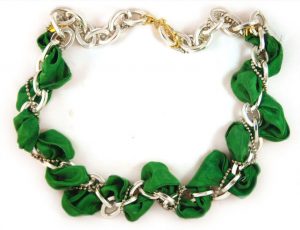
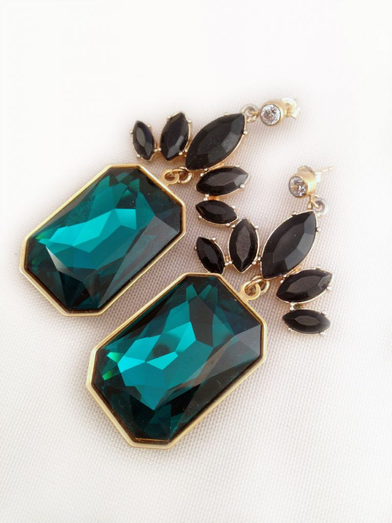
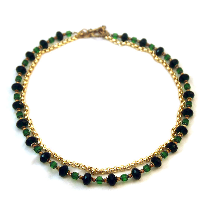
Multifaceted Emerald continues to sparkle and fascinate, bringing luxury and elegance to the palette, while yellow-toned Linden Green brings a lightness to the deeper shades of fall. Try pairing both with Mykonos Blue, a bold, meditative blue, for a classic and relaxed fall look. Exotic Acai adds mystery to the palette. Pair the elegant shade of purple with Emerald for a regal disposition, or spirited Samba red for an expressive and dramatic look. Koi, a decorative orange with dazzling and shimmering qualities, is a statement color that serves as a pick-me-up for your wardrobe. Vivacious, an unruly and wildly deep fuchsia, adds an ebullient sensuality to the palette.
Press Release
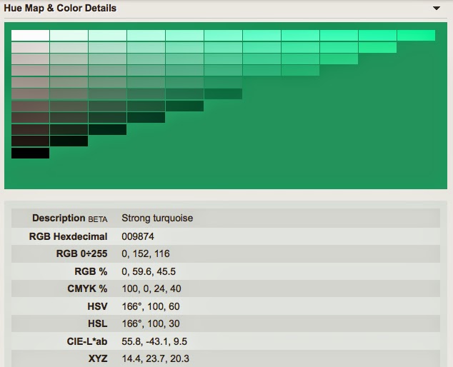
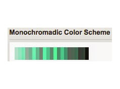
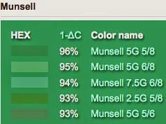
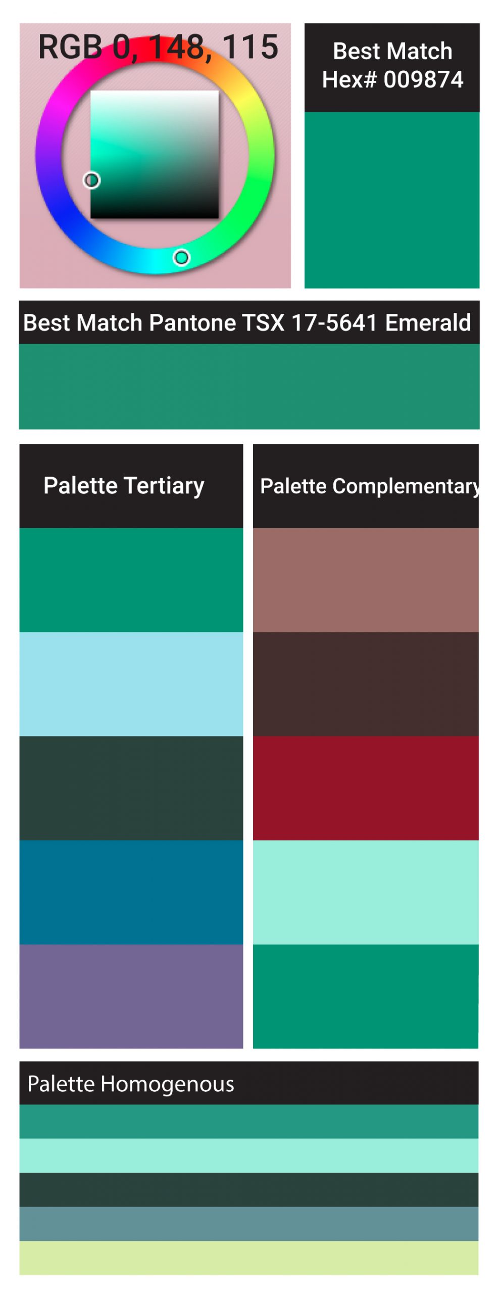
PANTONE 17-5641 Emerald
PANTONE 18-4434 Mykonos Blue
PANTONE 15-0533 Linden Green
PANTONE 19-3628 Acai
PANTONE 19-1662 Samba
PANTONE 17-1452 Koi
PANTONE 18-0312 Deep Lichen Green
PANTONE 19-2045 Vivacious
PANTONE 19-4215 Turbulence
PANTONE 19-1116 Carafe
Graphic Designers Resource for download: ASE Fall 2013 Color Trends Pantone Swatches
I started using ASE (or Adobe Swatch Exchange) swatches working at a Graphics Print House in Chelsea, New York a few years back. I now use ASE swatch libraries for most of my client’s projects.
So what are ASE Swatch Libraries? ASE’s are customized color palettes in which you choose colors and export them to an original file format called ASE from Illustrator for future use in Illustrator, InDesign or Photoshop. Importing the ASE files works very much like importing any other color swatch such as the preset Pantone® colors. Once imported the swatch will give you a dialog box palette window to hold your colors.

Import a ASE Color Swatch into Illustrator:
- In an open or existing document click the drop down arrow on your Swatches Palette.
- Select “Open Swatch Library>Other Library.
- Select the ASE file you would like to import and click open.
- A new palette box will appear with your imported colors.
For my other graphic design resources check out my category archives graphic section