Color Trends in Design 2022
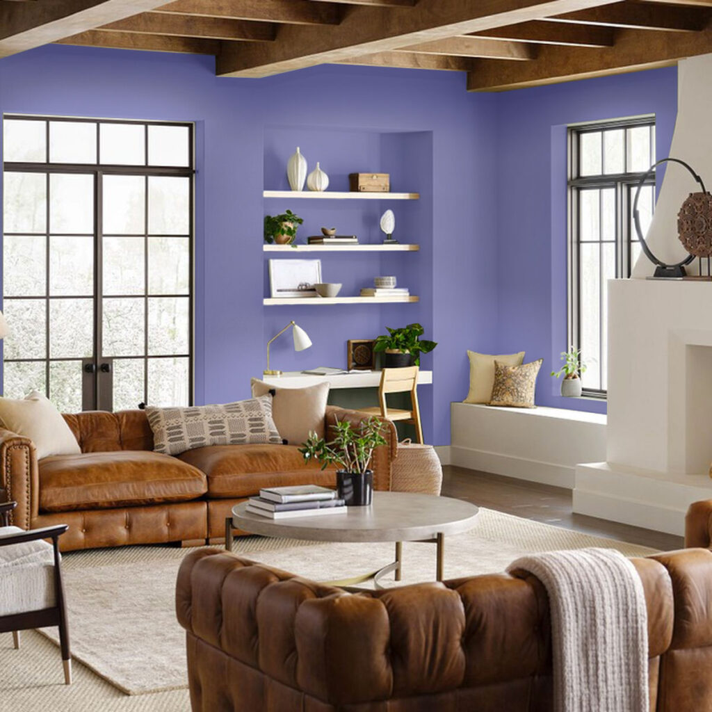
One of the color trends that we will begin to see in graphic design will be the use of something called Pantone colors. Marketing Color Consortiums drive large sections of commerce. How important is this to your art? It all depends. I tell my students that creating an original style (their unique signature) is the way to go. This includes the color palette that you have defined for yourself. You always have the choice to not use Pantone Trends and that in the end may be a better design choice. Knowing about Pantone colors is important you need to understand the industry you are designing for and not knowing about their existence is like not doing your art history homework.

After a year so full of ups and downs, users will want navigation experiences that are soothing colors. Therefore, the use of subtle blues, violet blues and reds will be of great importance for graphic design and will generate a great impact on users.
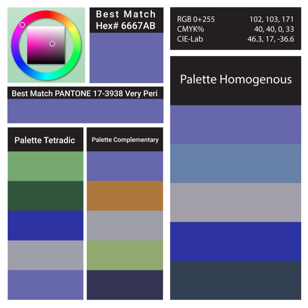
Detailed Color Analysis Series Very Peri

Color trends in graphic design 2022 Flat colors
2021 has shown us that we spend more and more time on our cell phones, computers, and tablets. The use of flat colors will guarantee the comfort of our eyes. Simple, subtle, fresh and natural designs that facilitate online navigation for a long time.
Motion Graphics
Whether you’re walking past a digital billboard, scrolling through a website, or navigating an app, we see more and more motion design at the moment. And most people in the profession believe this can only be a good thing. Static graphics have a way of being overlooked. The constant drive of digital platforms for something fresh and the rise of virtual reality have brands finding new ways of living online. The new possibilities and opportunities using motion and animation are becoming a better way to tell a story to sell a brand.
#graphicdesign #design #pantone2022 #veryperi #pantonecoloroftheyear
